Background
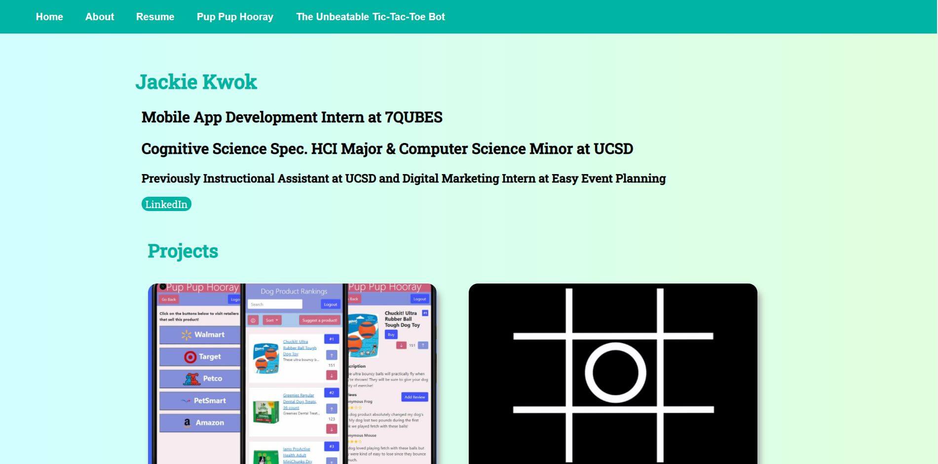
Welcome to my portfolio! This website is coded using vanilla HTML, CSS, and JavaScript, and is hosted on Firebase.
During my time at UCSD, I've taken classes that have allowed me to learn how to present my projects in the form of case studies. In these classes, I drafted different problem statements, background paragraphs, and design process explanations for a few of my projects. I received feedback from and gave feedback to other design students. The drafting stages of these classes helped me learn how to present myself for interviews.
Problem Statement Drafts for Pup Pup Hooray Case Study
Background Paragraph Drafts for Pup Pup Hooray Case Study
Design Process
Why Code At All?
Many of my mentors recommended using a website builder for my portfolio rather than coding a website myself. While you’re reading this on the website that I made myself, I actually had another profolio website hosted on Weebly. Weebly allowed me to quickly customize the layout of my webpages, which allowed me to receive feedback quickly.
However, I was limited in what I could do on my Weebly website. For example, if I wanted to implement a new design that I discovered online, Weebly's editor may not have support for it. Another issue that I had was that some of my pages weren't responsive for mobile.
When I first started coding my website, I started by trying to match the general design and layout from my Weebly site. I focused on making my website compatible with mobile devices since that was one of the problems I had with Weebly. I used media queries to detect when the screen’s width is smaller than a traditional desktop screen. Since I used CSS grids to layout the elements on my website, I repositioned the grid items depending on screen width.
Weebly Mobile Layout
Current Mobile Layout
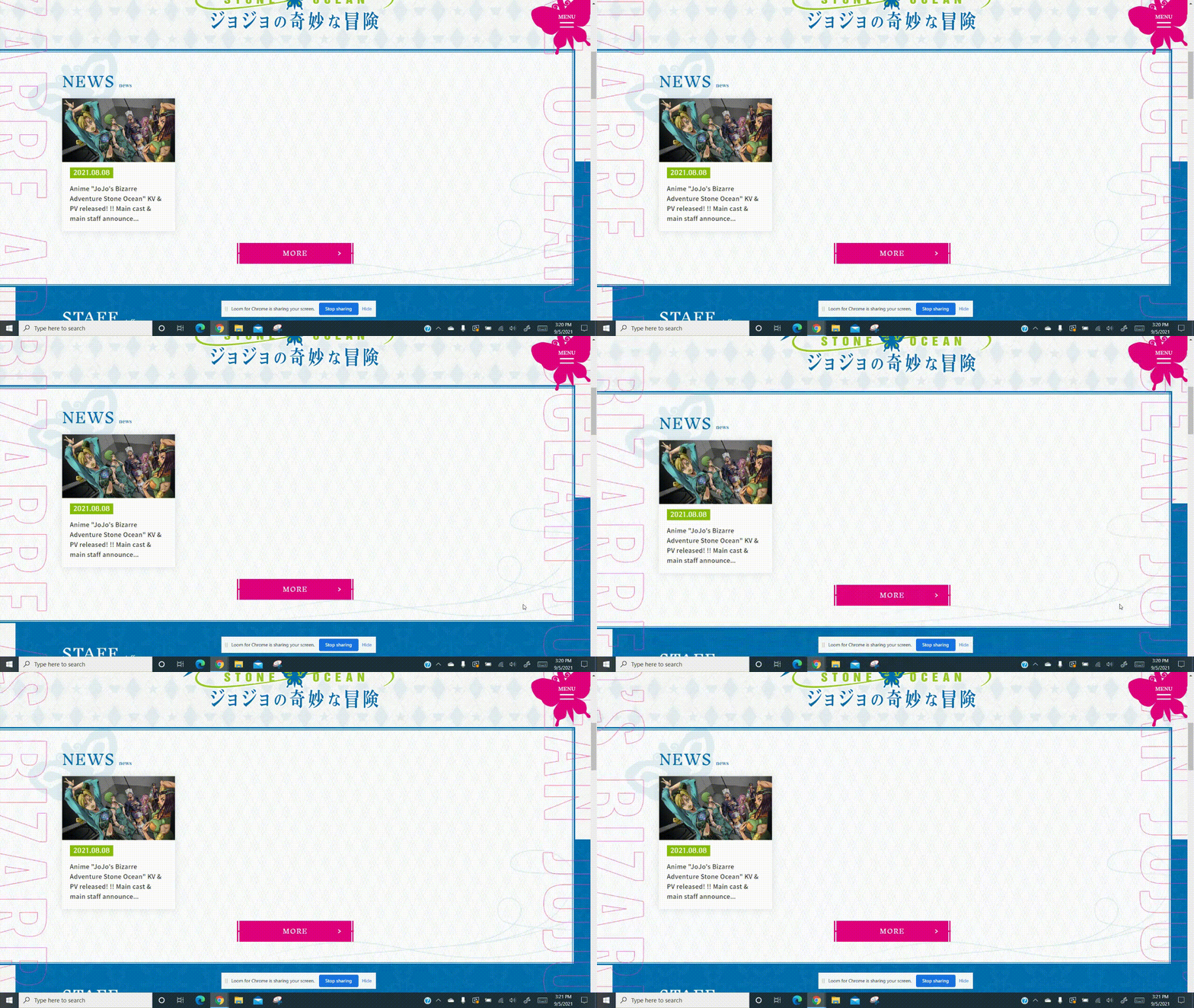
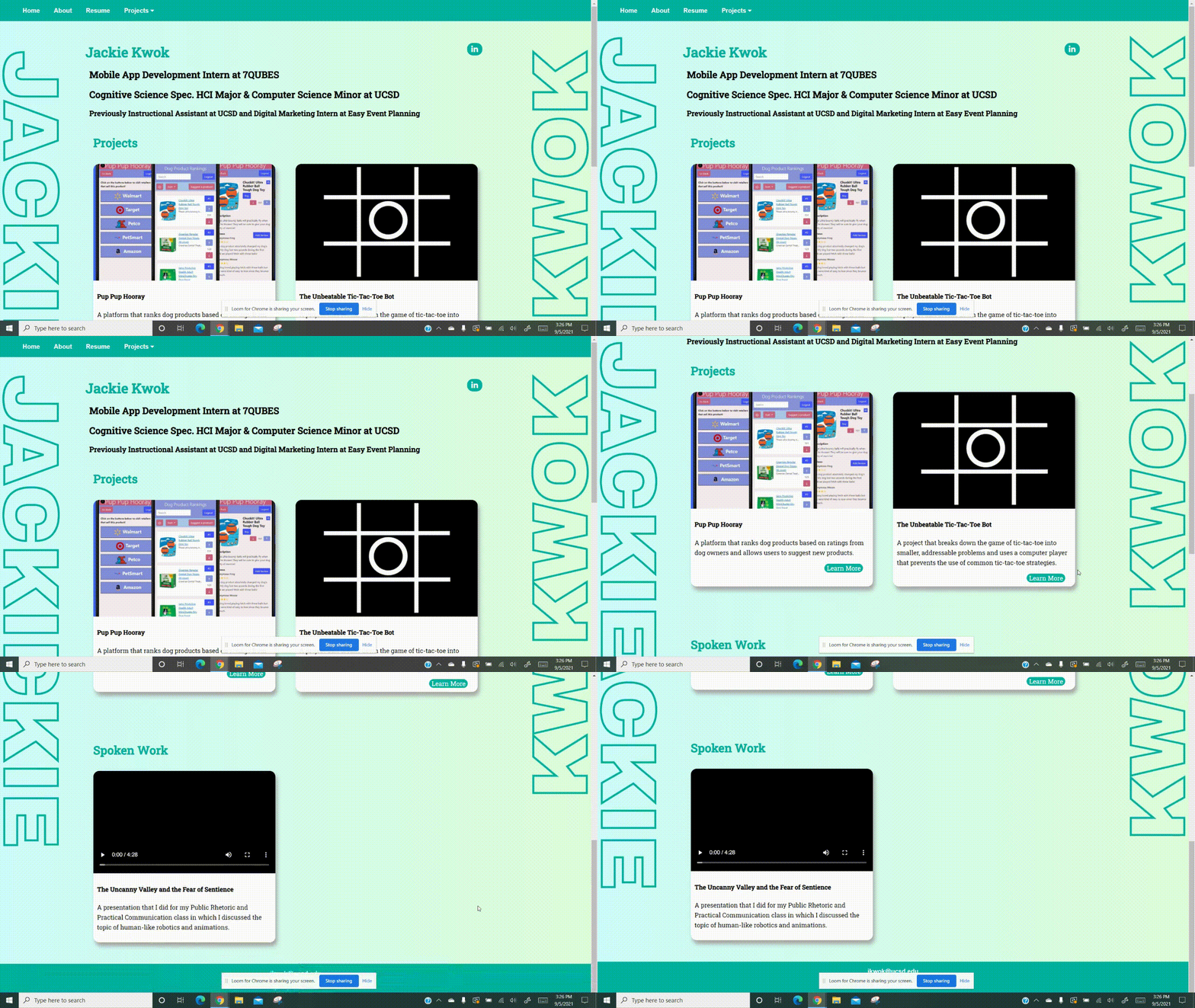
I've been trying to improve the design of my website by incorporating interesting features that I find from other websites. For example, I was interested in this website with vertical scrolling text in the page margins, so I tried to recreate this effect using CSS animations.

The design I took inspiration from

My take on the design
Reflection
Working on this website has pushed me to learn more about web development overall. Trying to replicate different designs usually involves me looking up different techniques with CSS and JavaScript. Some things that I added in the last few months were the hero image on my home page, glassmorphic design elements, a sticky navbar that shrinks and becomes translucent when the user scrolls, a personal logo, and more.
I haven't just been working on the look of my website though. In the past few month, I researched how I could get my own domain name and connect it to my website. I bought jackiekwok.com and learned how to connect it to my website using the Firebase console. I also added Google Analytics to to see information about how long users typically spend reading each case study
This website is constantly going through iterations as I continue to improve myself, so I hope this website improves each time you visit.
