.png)
Links
Source Code: github.com/jkwok626/ixd-skeleton
Mobile Web Application: a8-pup-pup-hooray.herokuapp.com/home (Please use mobile view)
Problem
Dog owners have difficulty finding dog products that other dog owners would recommend.
Background
We’ve all faced the situation where we buy a product online thinking it’s a wonderful deal, but then become massively disappointed when the product ends up being very low-quality. With cheap and sponsored products cluttering the pages of websites that sell dog products, it’s no wonder that dog owners could easily get frustrated while trying to find high-quality dog products. Even if some sites aren’t cluttered, dog owners still need to compare products across multiple websites that each sort their products differently. Seeing how other dog owners rate dog products would help a typical dog owner immensely.
Pup Pup Hooray is a mobile web application that my teammates, Elise Kim and Jorge Castaneda, and I created for the class COGS 120: Interaction Design. Pup Pup Hooray sorts dog products based on an upvote/downvote system, which means that high-quality products naturally get pushed to the top of the page by dog owners. If dog owners see a product they're interested in, they can click on it and see a brief description for that product and read reviews from other dog owners who have purchased that product.
In this project, I had a more technical role at first, but as we progressed through the project, I found myself participating in all the aspects of the project, which includes needfinding, design, user testing, and development. For the development of our app, we used HTML, CSS, AJAX, JSON, and Node.js.
Design Process
Storyboarding
Before we started designing anything, we wanted to see if our problem was actually a real-world problem and we also wanted to imagine situations where our target user group would use our app. To do this, we each made a storyboard that illustrated a different situation in which dog owners would turn to our app.
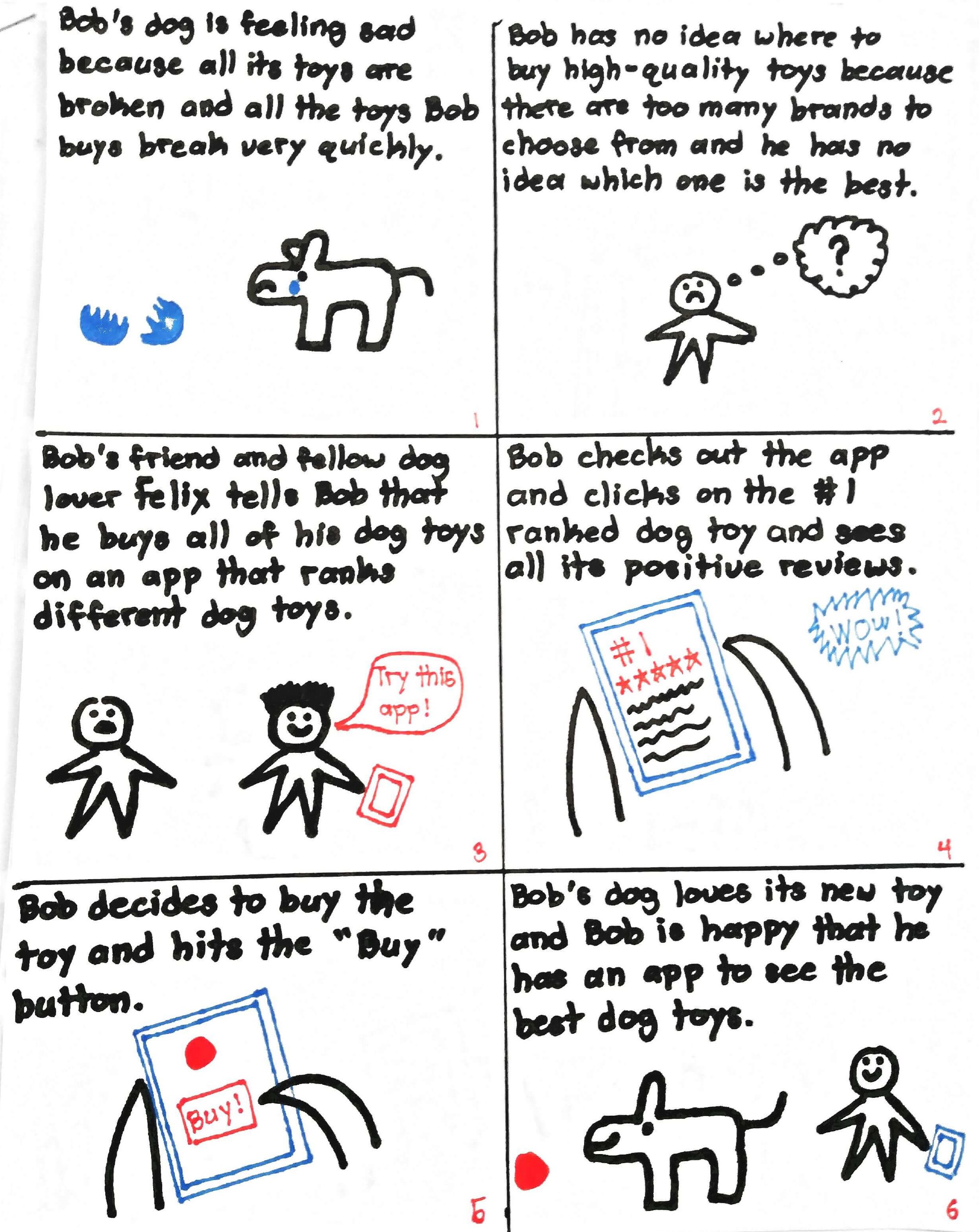
My Storyboard
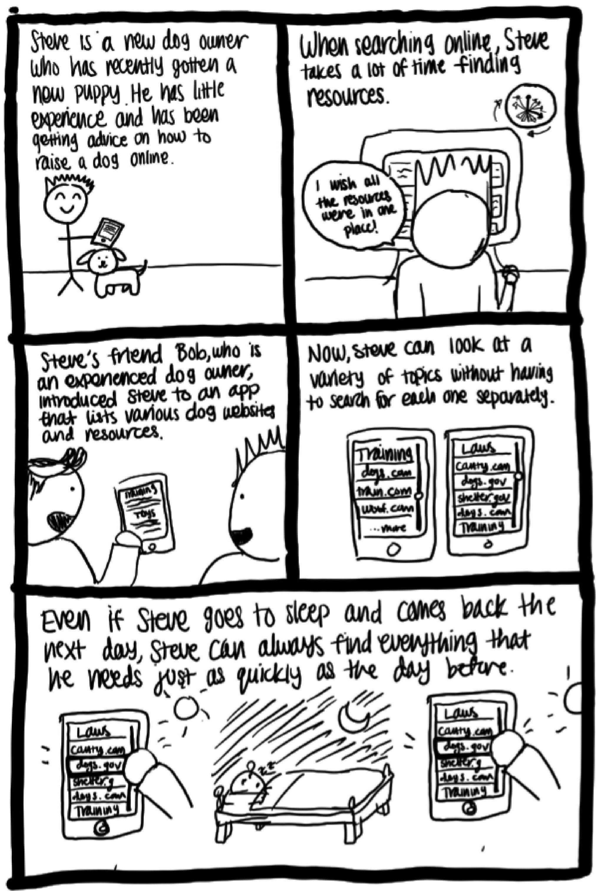
Elise's Storyboard
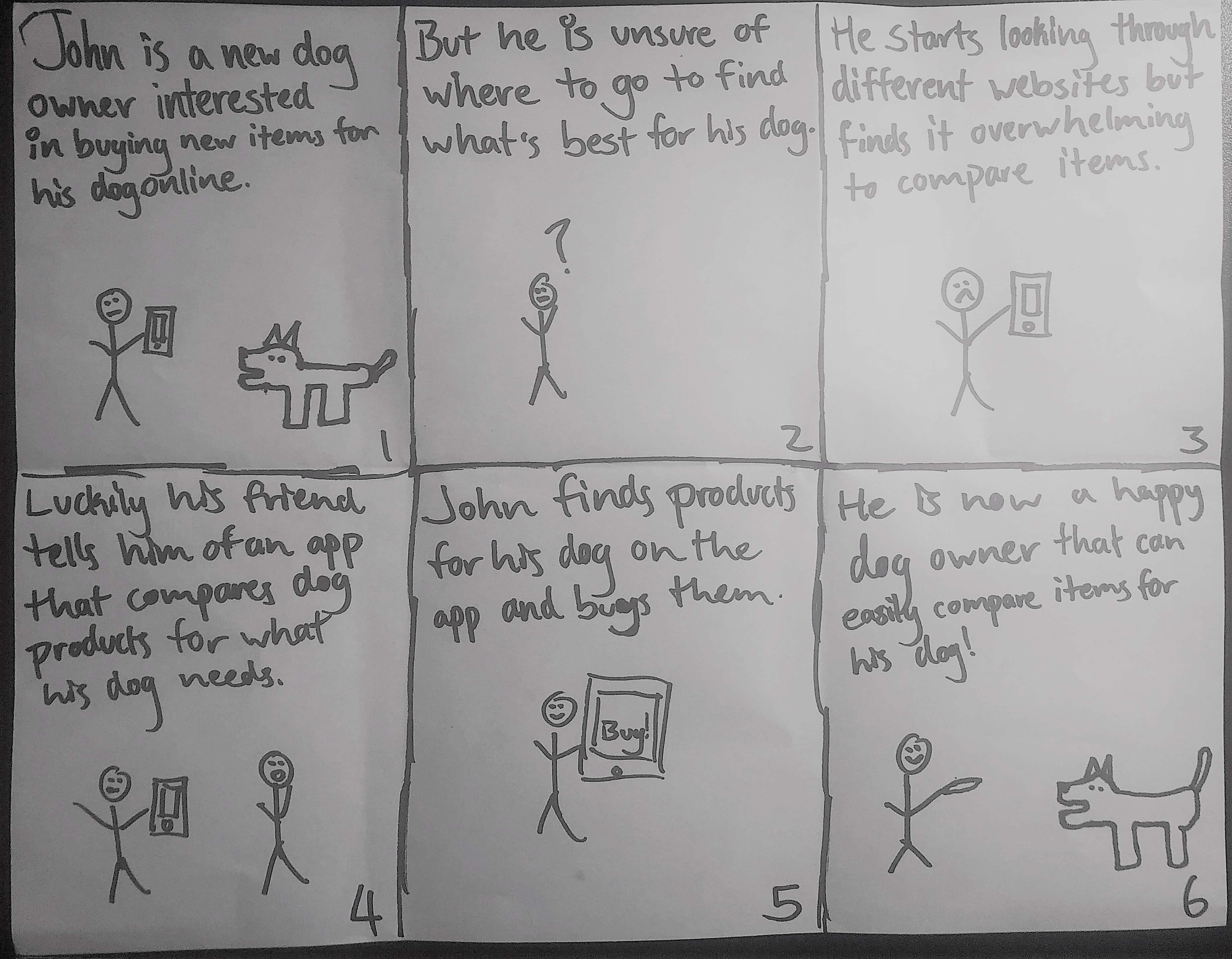
Jorge's Storyboard
Paper Prototypes and User Testing
Once we decided that our problem was a real problem that we can solve, we made two paper prototypes with drastically different designs. The first prototype, which I drew, utilized a list-based interface, which put a heavy emphasis on the ranking system. This design also featured collapsible tabs which allows users to see pictures of products, reviews, and a "Buy" button.
Our second design, which was drawn by Elise, focused on allowing users to compare products that they were interested in. The first big priority of this prototype was the ability to sort products by a category, like Toys, Food, etc. The second priority was the actual comparison page, which allowed users to compare products' features.
We then tested our prototypes with our fellow classmates. Something that I personally learned was that, even though my team found our prototypes easy to understand, that wasn’t always the case with people outside of our team. Sometimes, our testers didn't know what to click next or what a certain button would do. Because of this, we decided that we needed to implement a "Help" screen or prompts that guide the user through the app. One of our users was also unsure about how our review system would work, so she suggested that we implement a login system. All of our testers were also confused about how each product earned its rank in our first prototype.
Overall, our testers said that they preferred the first prototype with the list-based interface because the home screen wasn't as cluttered as our second prototype's grid of products. However, they said that they liked the sorting feature from the second prototype and they liked that the second prototype had pictures on the home screen.
Digital Wireframes
Now, we knew which core features our design needed, so we started creating digital wireframes for our two most important screens using Marvel. We kept these wireframes mostly grayscale so that we could focus on the overall layout of our design rather than the color.
We incorporated our user feedback by keeping the list-based ranking interface, but we also added arrows because we decided that we wanted to do a Reddit-style upvote/downvote system. We kept the sort feature and and even added a search bar to help users quickly find products. We also added a "Help" icon next to the "Sort" dropdown.
A problem that we quickly ran into as we were making these wireframes was how to display product information. We realized that each product had to have a large image, a description, and potentially long user reviews. In our first prototype, we used collapsible tabs to show this information, so if we had continued with the collapsible tabs idea, we would've had to shorten the product information or use a really small font size. Even so, the tab for one product would've taken up the entire screen when fully expanded.
We ultimately decided that it would be much more practical to have a "Product" page dedicated to each product. This way we weren't limited to the space inside a small tab and we wouldn't have any readability issues since we wouldn't need to shrink the font size.
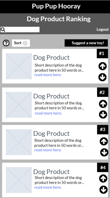
Home Screen Wireframe
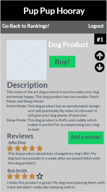
Product Page Wireframe
Coded Grayscreens
When we started to actually code our app, we followed the layouts of our digital wireframes and we started off by just doing the home and "Product" screens first, since we believed that they were the most important.
As the weeks went by, we implemented more screens that we liked from our paper prototypes and we added real dog products.
Over time, we also made our app use the same screens for different products. For example, we technically only have one "Product" page, but the information on the "Product" page will change depending on whichever product the user clicks on.
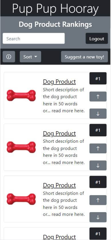
Coded Home Screen
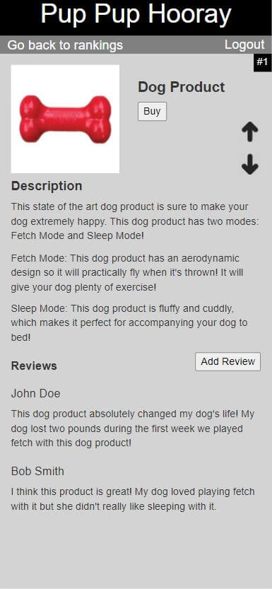
Coded Product Page
Final Design
When a user first enters our app, they will prompted to log in with their Facebook account.
Once they are logged in, the user will be brought straight to our home screen where they can sort the visible products by category. If the user is looking for a specific product is featured, they can use the search bar to find that product. The user can also upvote or downvote the products, which would update the ranking of the products.
If the user doesn't see one of their favorite products on our app, they can hit the "Suggest a product!" button to add a product to our list. They'll have to enter the name of the product, what category it fits under, and a brief description of the product.
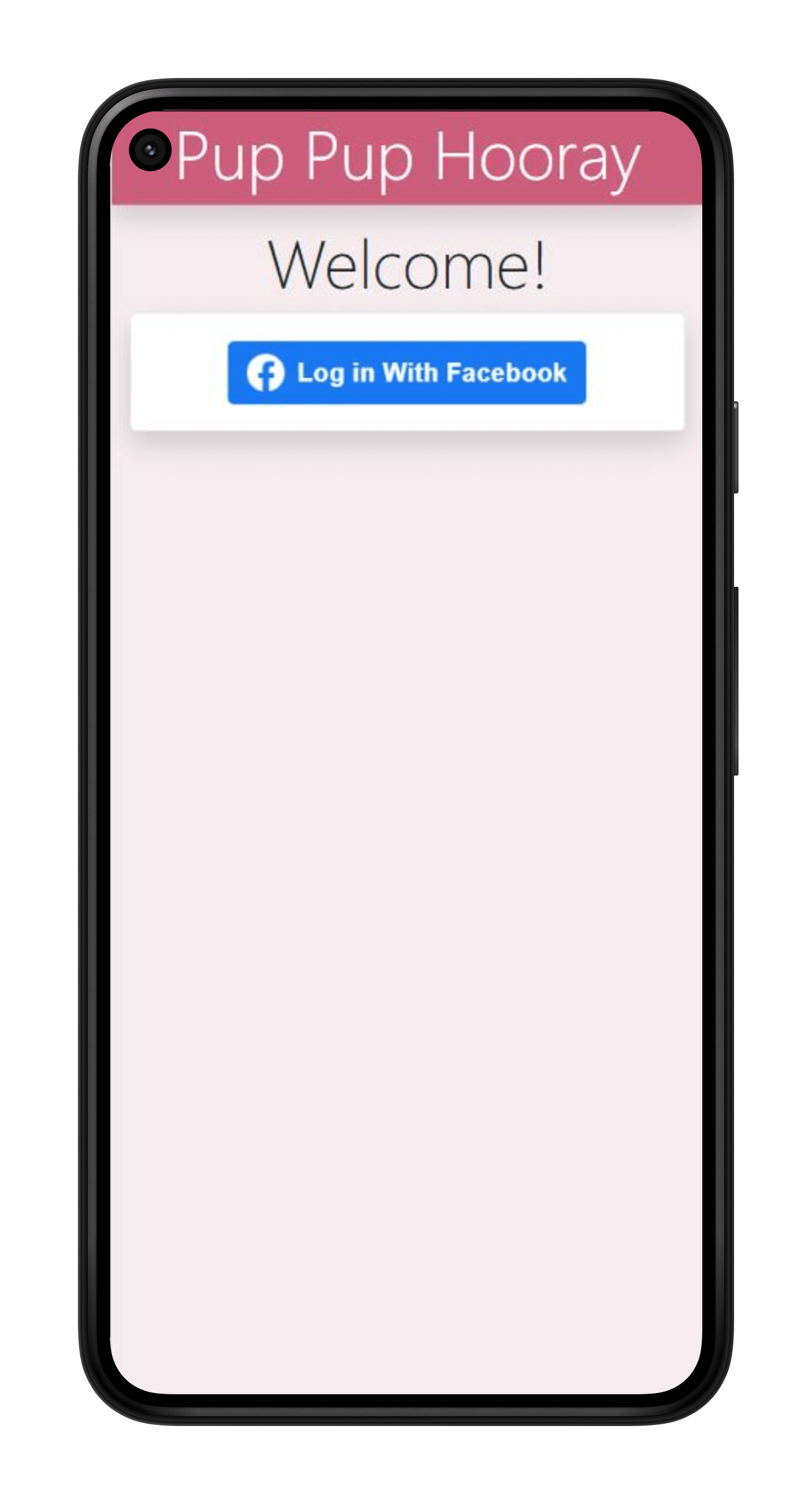
Login Screen
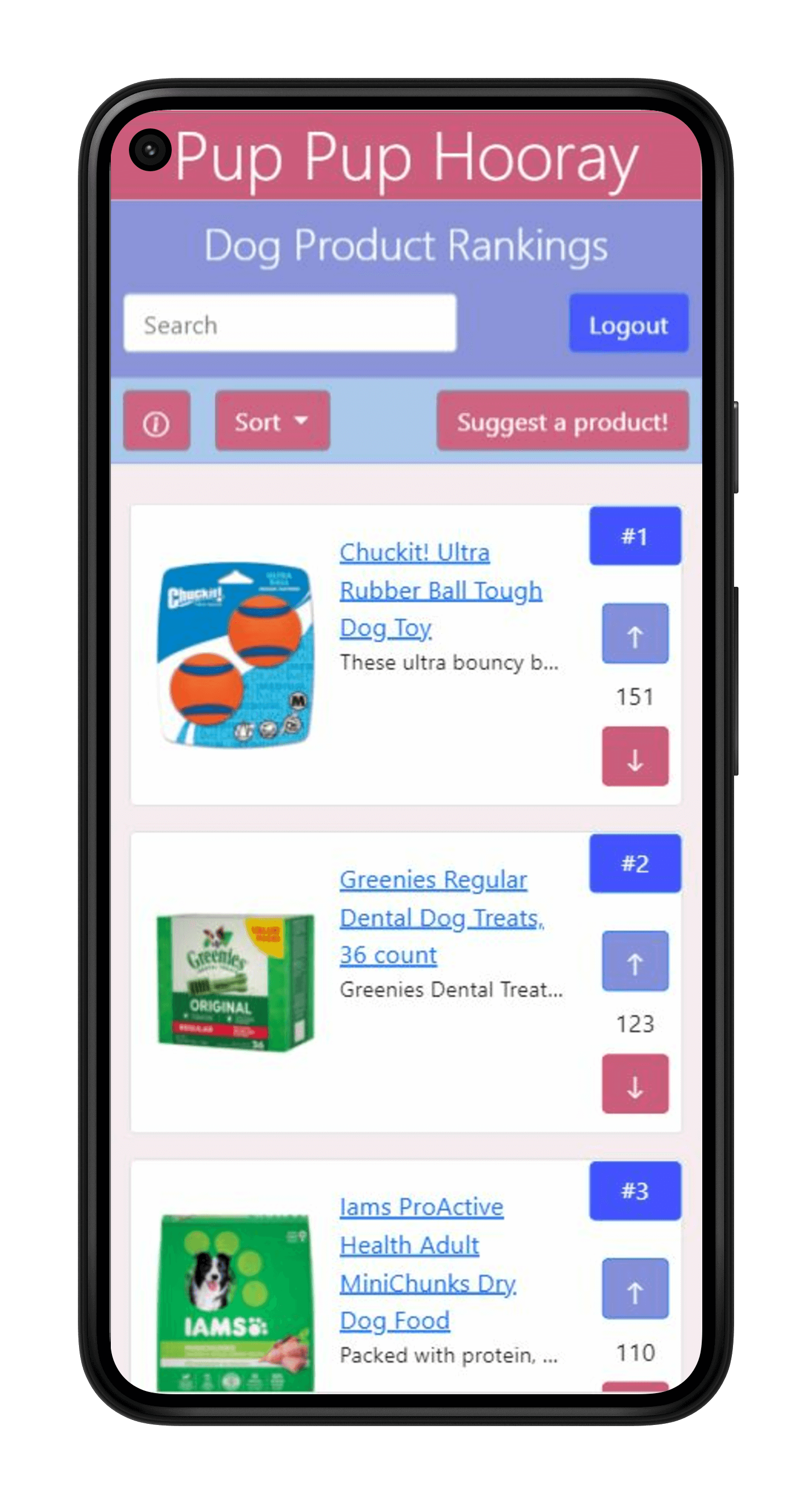
Home Screen
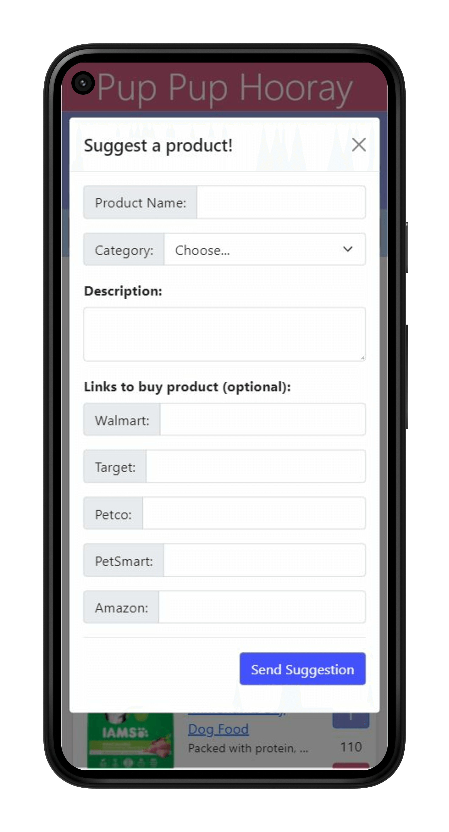
Suggest Screen
Once the user finds a product on the home screen that they're interested in, they can click on that product's name or image to get to its product page. On the product page, the user can read a brief description of the product and reviews for that product. They can also upvote and downvote the product just like on the home screen.
If the user wants to purchase that product, they can hit the "Buy" button, which will lead them to a screen of buttons. Clicking on these buttons will direct users to popular retailers that sell the product, like Walmart and Target. For example, if the user clicks on the Walmart button for the product "Bouncy Ball," they will be redirected to the product page for "Bouncy Ball" on Walmart's website.
If the user has experience with the product, they can click the "Add Review" button to share their thoughts with other users. The review that the user writes will be added back to the product page.
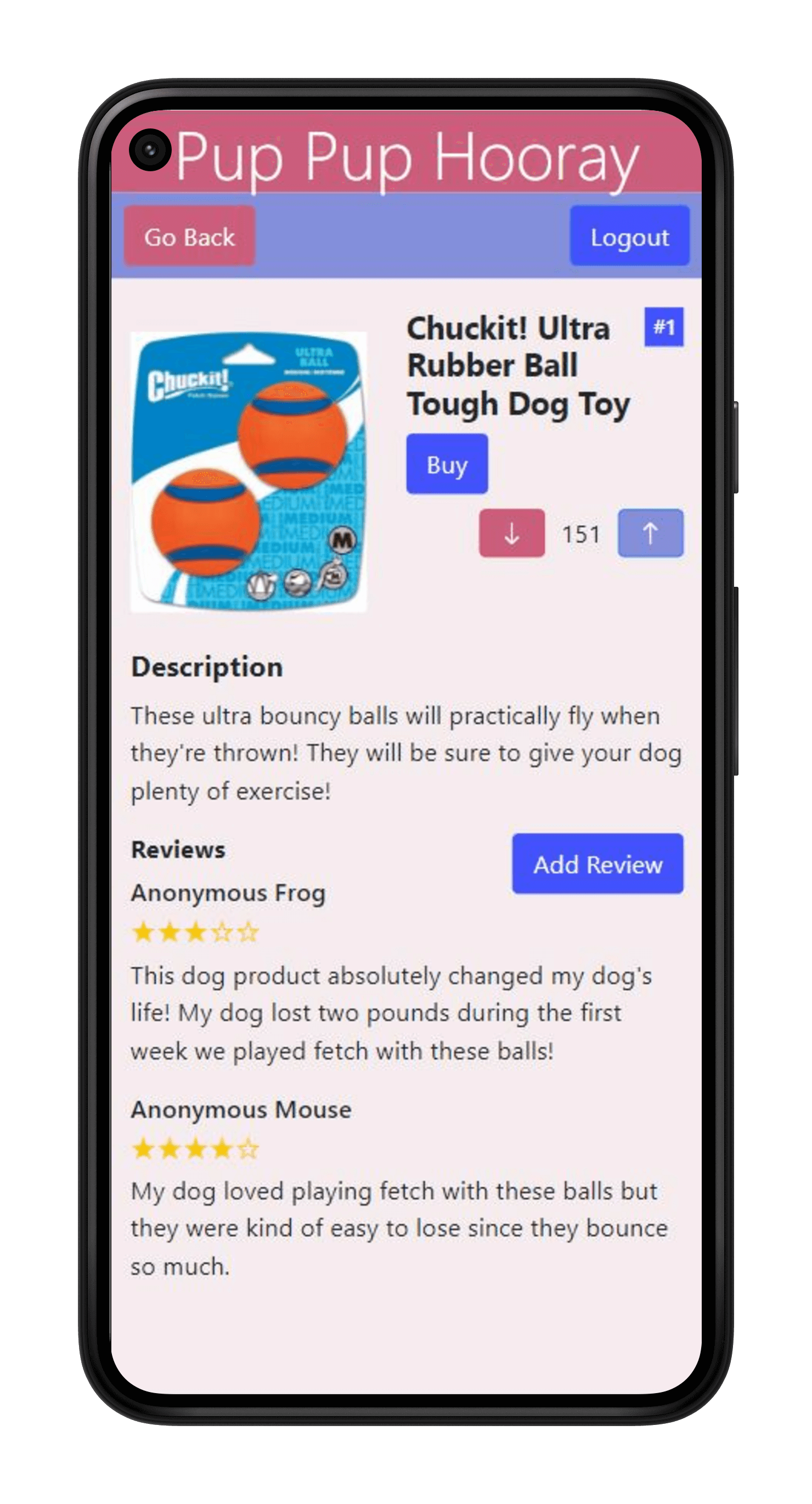
Product Page
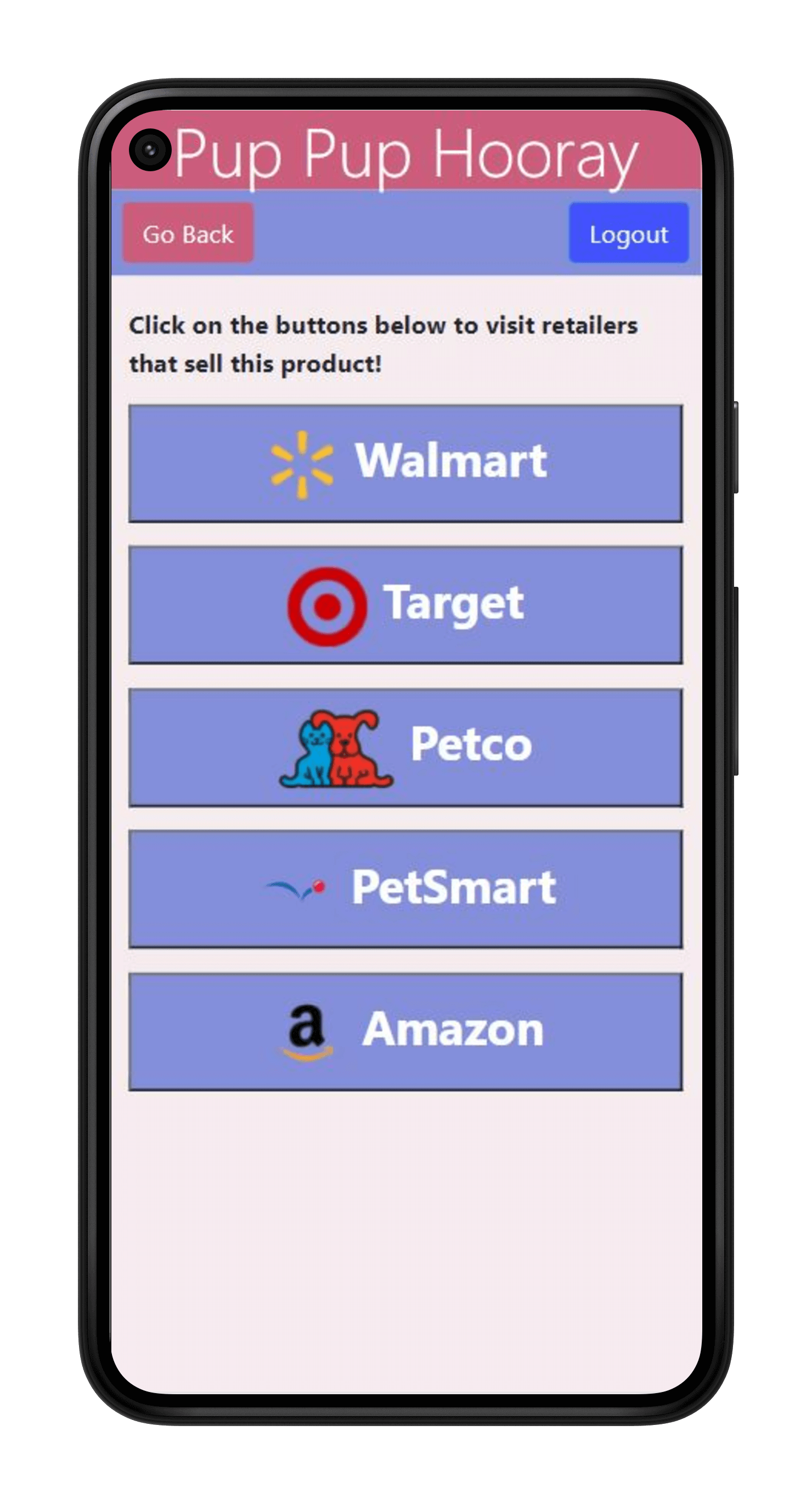
Buy Screen
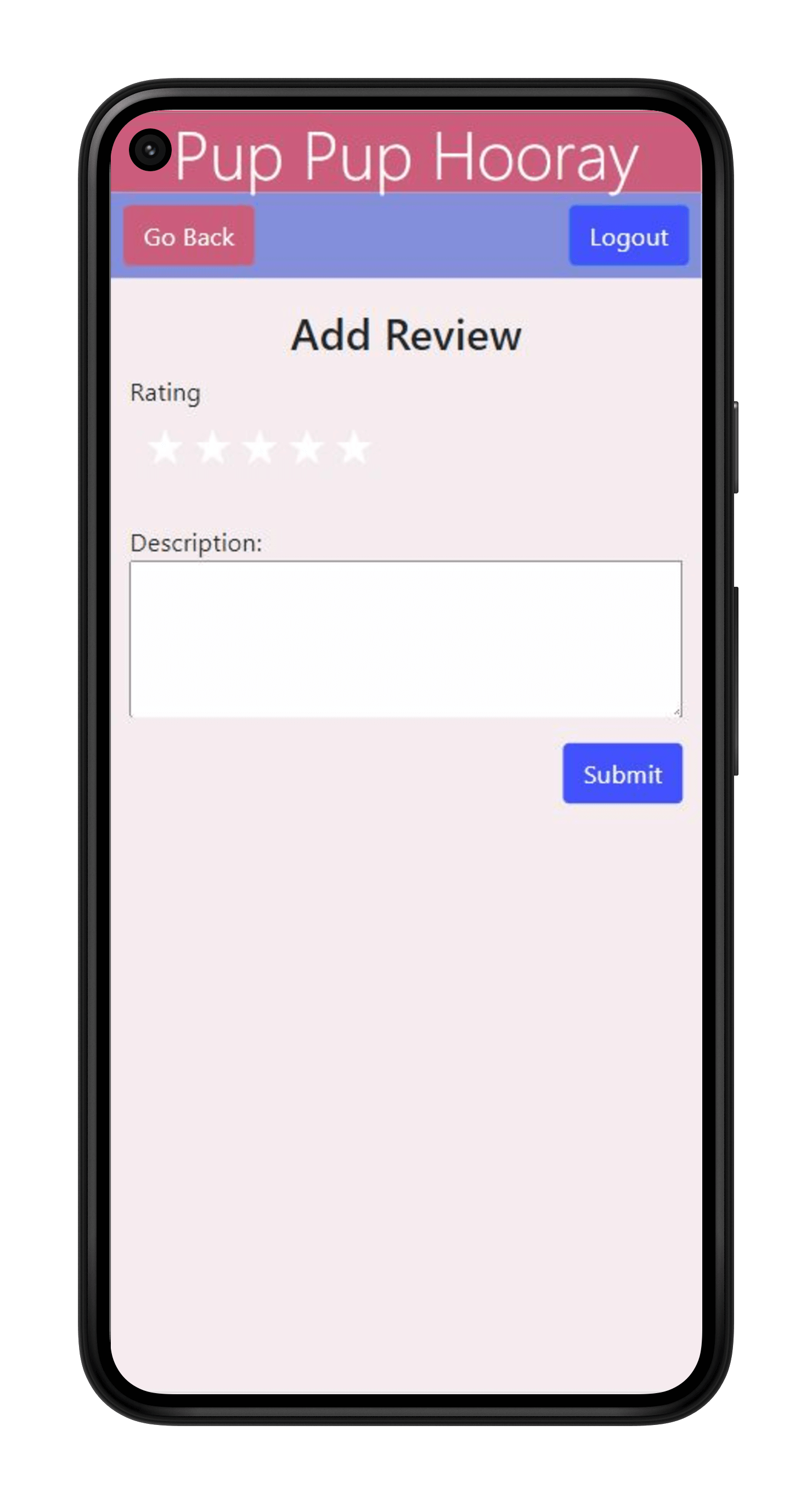
Review Screen
Finally, if the user has questions about how to use our app, they can click on the "Help" button on the home screen to bring up a list of frequently asked questions.
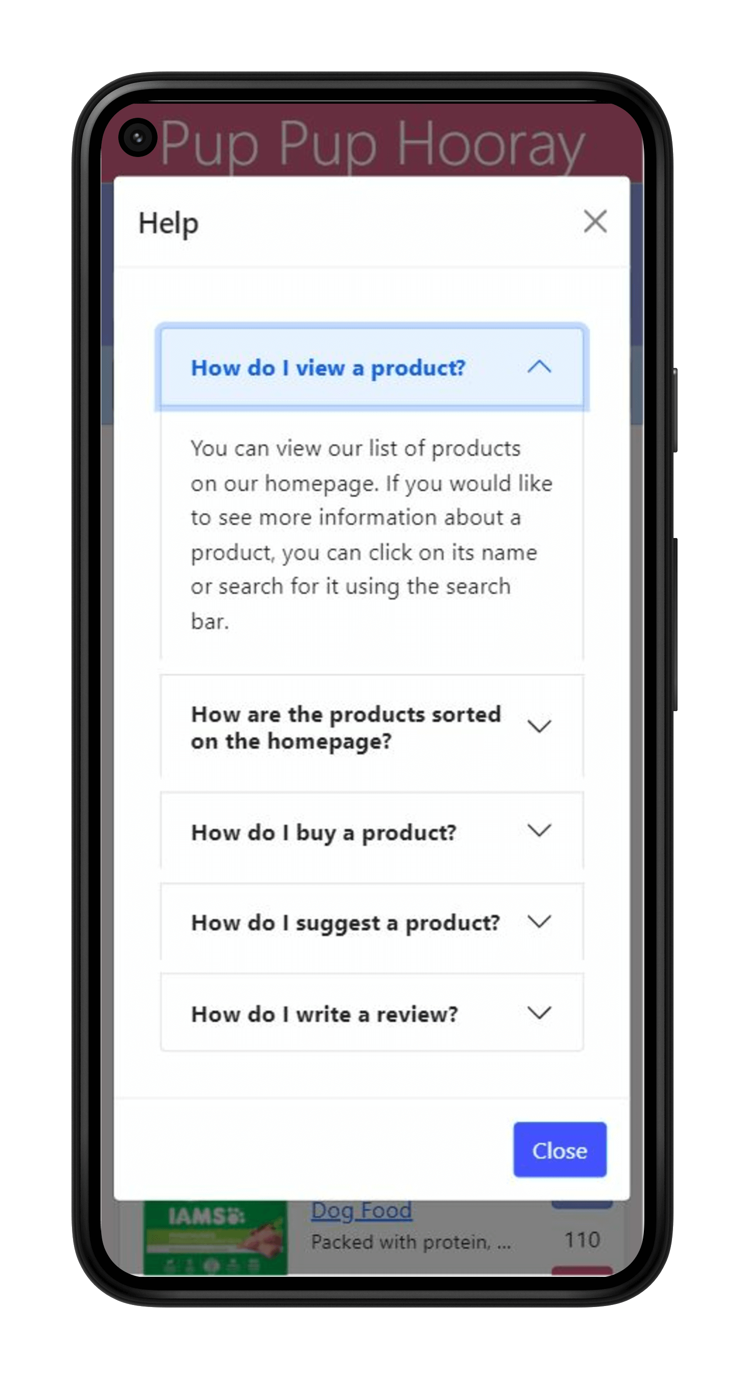
Help Screen
Constraints and Potential Improvements
Since this was a class project, we had to follow assignment guidelines throughout our entire project. For example, we were required to use JSON data and we were advised not to use something like MongoDB since it wasn’t covered by the class. I would like to learn to use a cloud-based database because I think it would be more flexible than purely using JSON.
We also had limited time since we had to finish the project by the end of the class, so we had one week for storyboarding and prototyping, one week for user testing, and four weeks for development. There were some features in our paper prototypes that we didn't have enough time to implement, such as the "Comparison" screen, so I would like to implement these features if I were to improve this project.
I would also like to refine our login system. We learned how to implement a Facebook login, but we didn't have enough time to learn how to actually use any of the Facebook data from logging in. Right now, we don't actually have separate profiles for each Facebook account. For example, every time a user writes a review, our app will just say that "Anonymous [Animal]" made the review and the review is permanent. I would like to make actual user profiles so that users can actually leave reviews with their names and delete or edit their reviews.
Finally, I would love to finish this app and actually let real users use it. While the products we currently feature are real products, I actually pre-wrote their rankings, descriptions, reviews, etc. in a JSON file. My ultimate end-goal for this project would be to have a community of dog owners who run the social aspects of this app on their own.