
Link
High-Fidelity Prototype: tinyurl.com/32xf8478
Problem
People often don't have much time to read news, which means that they also don't have much time to fact-check the little news that they do read. Also, fact-checking is usually not an easily accesible feature on many different apps and websites.
Background
We've all heard about how social media plays a big role in the spread of social media, but my group wanted to find out why this problem happens and how we could design a solution.
The Daily Dumpling is a high-fidelity prototype of an app that was created by my teammates, Danlin Jiang, Tony Tang, and Khiem Pham, and I. We made The Daily Dumpling with the aim of fighting misinformation. We did this with our core features, which were built-in fact-checking, a summary for each article, and multiperspective comments.
My team created this project for the class DSGN 100: Prototyping. I served as the team lead and we broke down our project into two phases, User Testing and Mobile Information System.
We created The Daily Dumpling using Figma.
User Testing
Understanding the Problem
When we first started, our topic was still fairly broad because all we knew was that we wanted to study the relationship between social media and misinformation. We researched different online resources to further understand our topic. We also found different online communities in order to understand our target audience. During this stage of our research, we learned about the repetition theory, which means that people are more likely to believe something if they're shown it multiple times, and the "Toxic Like Button," which means that people are more likely to believe something is true if it has a lot of likes.
Once we had a better understanding of our topic and audience, we started preparing questions for an online questionnaire. We asked our users questions about how much time they spent on social media, how much time they spent consuming news, and their main source of news. After we got a decent amount of responses, we did more in-depth interviews with a few respondents.
From our interviews, we found out that they believe news on social media is generally credible, but some of them also agreed that their perception of credibility has been swayed by the number of likes something has. Two of them also mentioned the idea of Selected Information, which means that the news sometimes only reports evidence that's beneficial to their side.
Personas
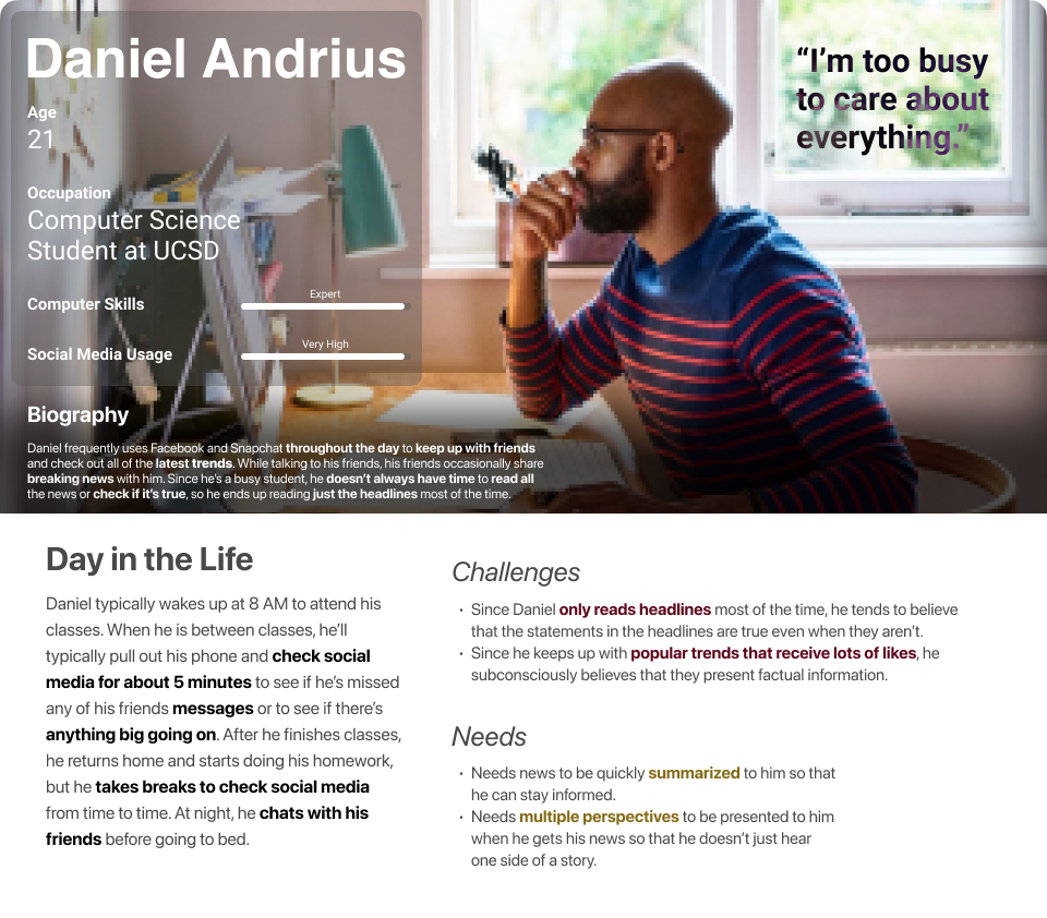
Primary Stakeholder Persona
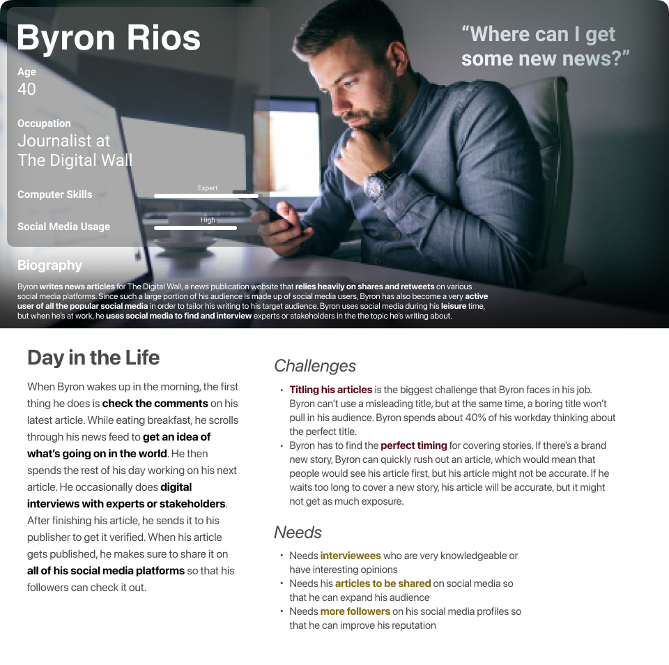
Secondary Stakeholder Persona
Mobile Information System
Features
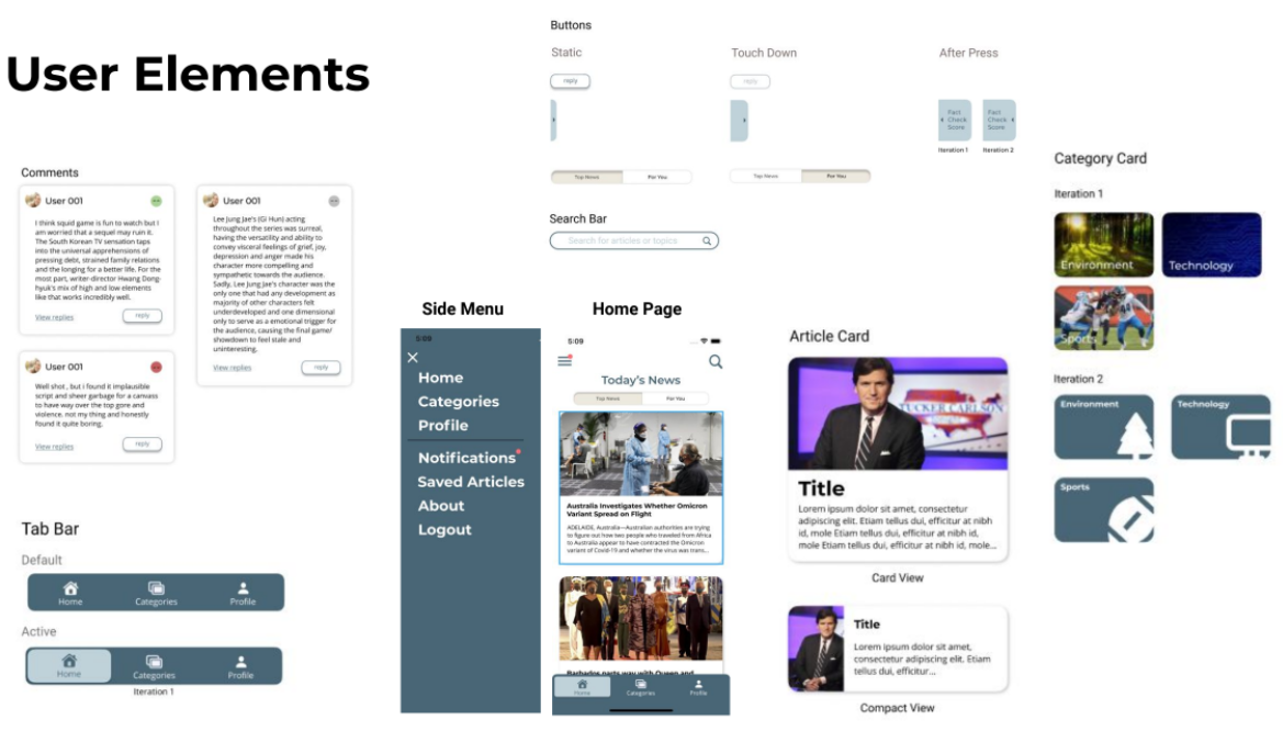
We definitely wanted our app to have a fact-checking feature. During a competitive analysis in which we compared our ideas to the features of other news aggregator services and social media platforms, we found that none of our competitors had easily accessible fact-checking. For platforms that did support fact-checking, users would have navigate to different pages to find it and these platforms didn't have fact-checking for every article. For our design, we created our own article page instead of just opening articles in an external browser. This meant that we could decide how to display our fact-checking to the user. In our design, the user can swipe right from the left edge of the article page to see a fact-checking score for each paragraph of the article. At the end of the article, there's an overall fact-checking score.
Since lack of time was one of the issues that our interviewees faced, we decided that our app should include a short summary along with each article's title. This way, users don't have to read an entire article to understand the main point.
The last feature that we wanted to implement addressed the "Selected Information" that our interviewees mentioned. If an article is heavily biased, we reasoned that people who know the other side of the story will comment. So for the comments section for each article in our app, we decided to label each comment as "Positive," "Negative," or "Neutral." This way, users can quickly see multiple perspectives on each article.
Low-Fidelity Prototype
We each first made a rough sketch of what we wanted our design to look like based on our features. Then we started picking out details from each of our sketches to create our Lo-Fi prototype.
We did some user-testing after finishing the first iteration of this prototype. Some of the suggestions our users gave us were to include a search bar, give users a way to check their notifications. They also asked us how we recommended articles on our home screen. For example, are the displayed articles the top news for the day or are they personalized recommendations?
In response to our user testing, we added a search icon in the top right of the screen. This search icon expands into a full search bar when clicked. We added a "Notifications" option in our side menu. Finally, we added a tabbed menu to the top of our home screen which allows user to choose between the Top News and the news tailored for them.
This is the final iteration of our Lo-Fi prototype:
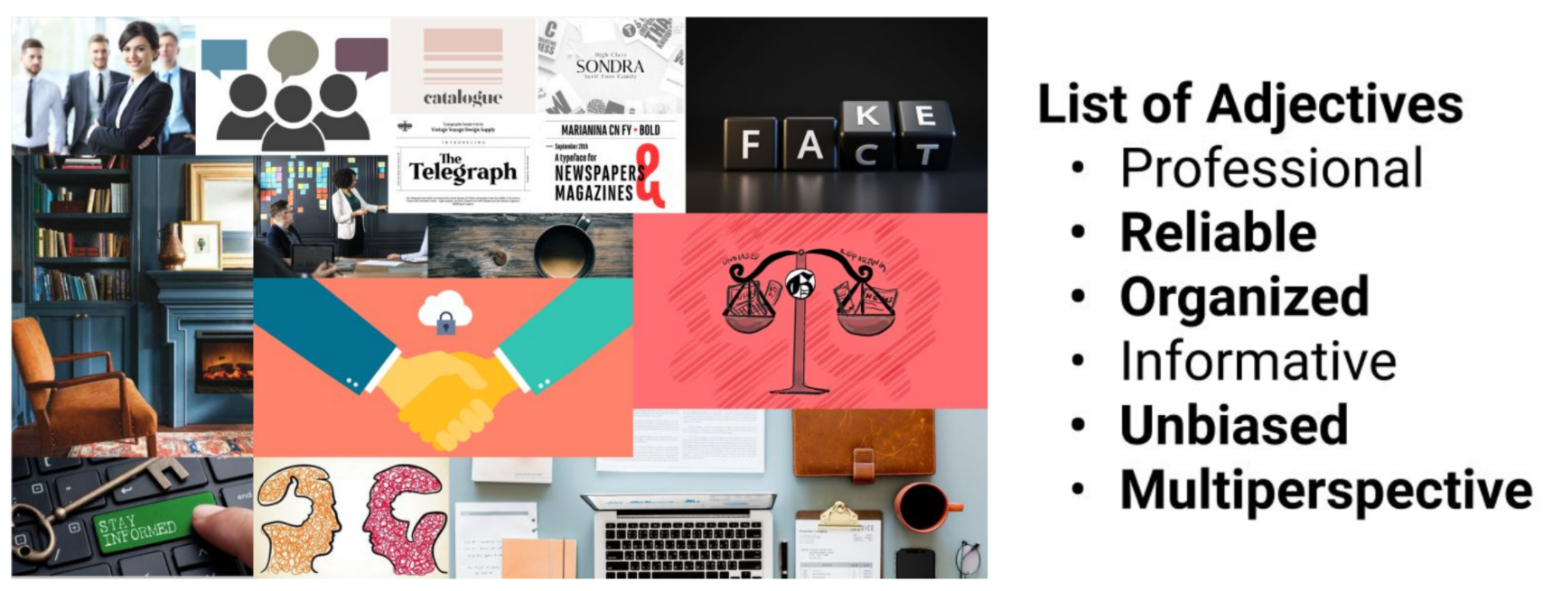
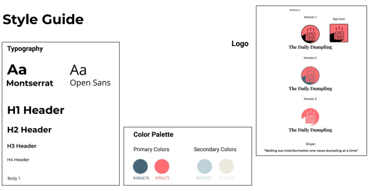
Moodboard and Style Guide
To create our moodboard, we created a list of adjectives that described our app and then chose images based on these adjectives.
From our moodboard, we chose our app's primary and secondary colors. We decided on the type of fonts we wanted to use and picked a logo. We also updated some of our user elements from our Lo-Fi prototype for our Hi-Fi prototype.
Final Design
For our Hi-Fi prototype, we incorporated the colors and fonts we decided on. We added in some article thumbnails to make our prototype resemble a real app. We also added Signup and Login screens.