
Link
High-Fidelity Prototype: tinyurl.com/2urz8sb9
Problem
Amazon shoppers need a simple way to stay alert about their spending habits in order to avoid financial burdens and buyers remorse.
Background
Have you ever gotten a large credit card bill and had no idea what all the charges are? Without proper management, you just have to deal with the large payment –– and this can happen to any online shopper! There’s nothing that tells you that you’ve spent X amount of money in the last couple days when you add another item to your cart. As such, our target users would be people who primarily shop on Amazon but don’t manage their savings.
I came up with the idea for this project when a friend of mine told me that she had racked up an $1800 credit card bill without realizing it. My team, which consisted of Taekyu Lee, Stanley Lee, Duha Kim, and I, sought to address this issue by adding a new feature to Amazon that would allow users to limit their own spending and show them detailed statistics about the total amount they’ve spent over certain periods of time in order to keep them more informed about their spending habits. I personally had the roles of User Researcher, Persona Designer, UX Flow Designer, and Prototype Designer.
Initially Understanding Online Shoppers
Amazon streamlines its checkout process, which makes it very quick and easy to purchase something without a second thought. But is this the only reason that could contrbute to overspending? Do Amazon users normally budget their spending? Do they use budgetting apps? If they do, what do they like about those budgetting apps?
Key Insights
- 50% of Amazon users range from not budgetting at all to rarely budgetting
- 38.5% of Amazon users can't explain how to check their Order History
- Of the users who are Amazon Prime subscribers, 86.2% let their subscriptions renew automatically
Personas
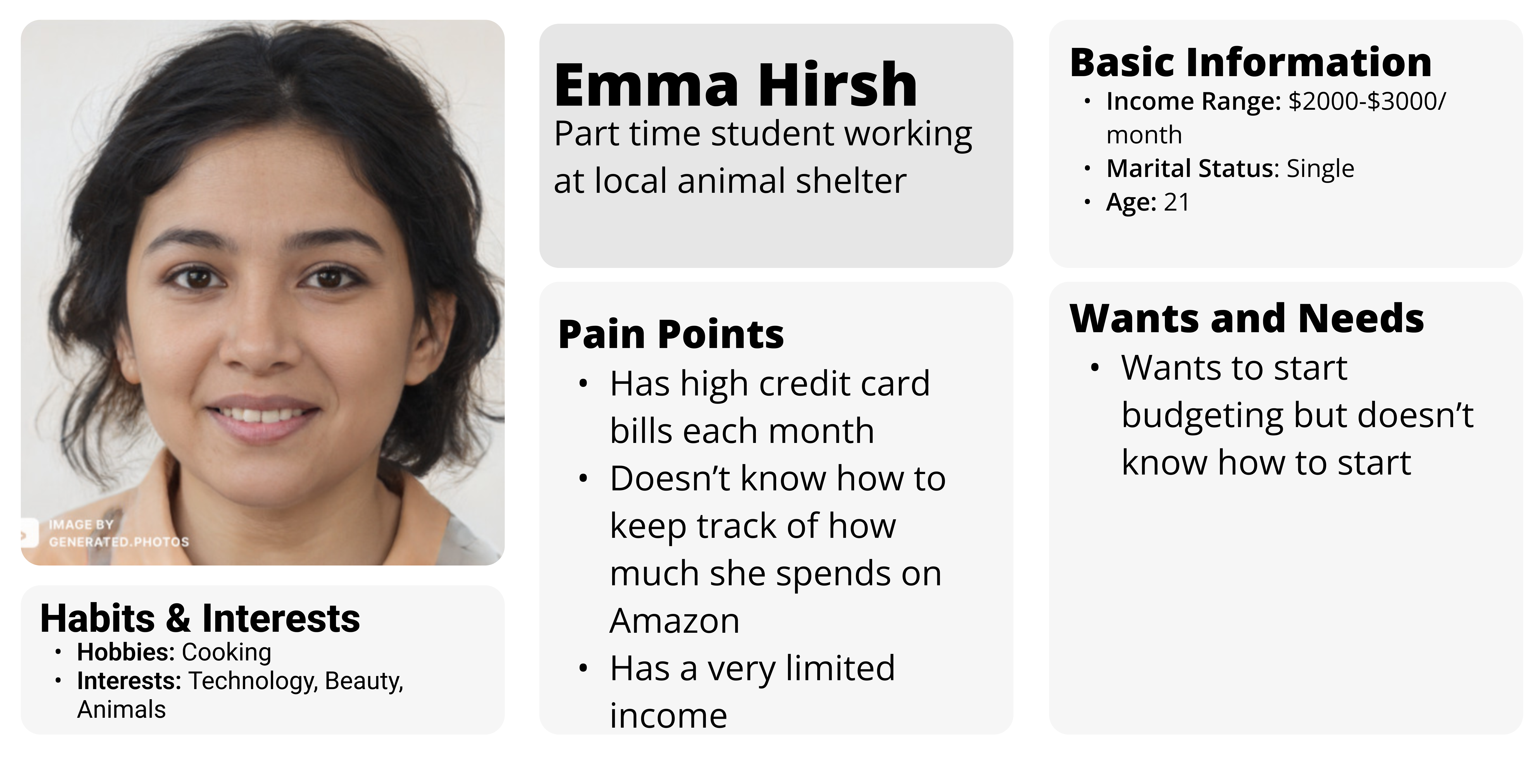
Primary Stakeholder Persona
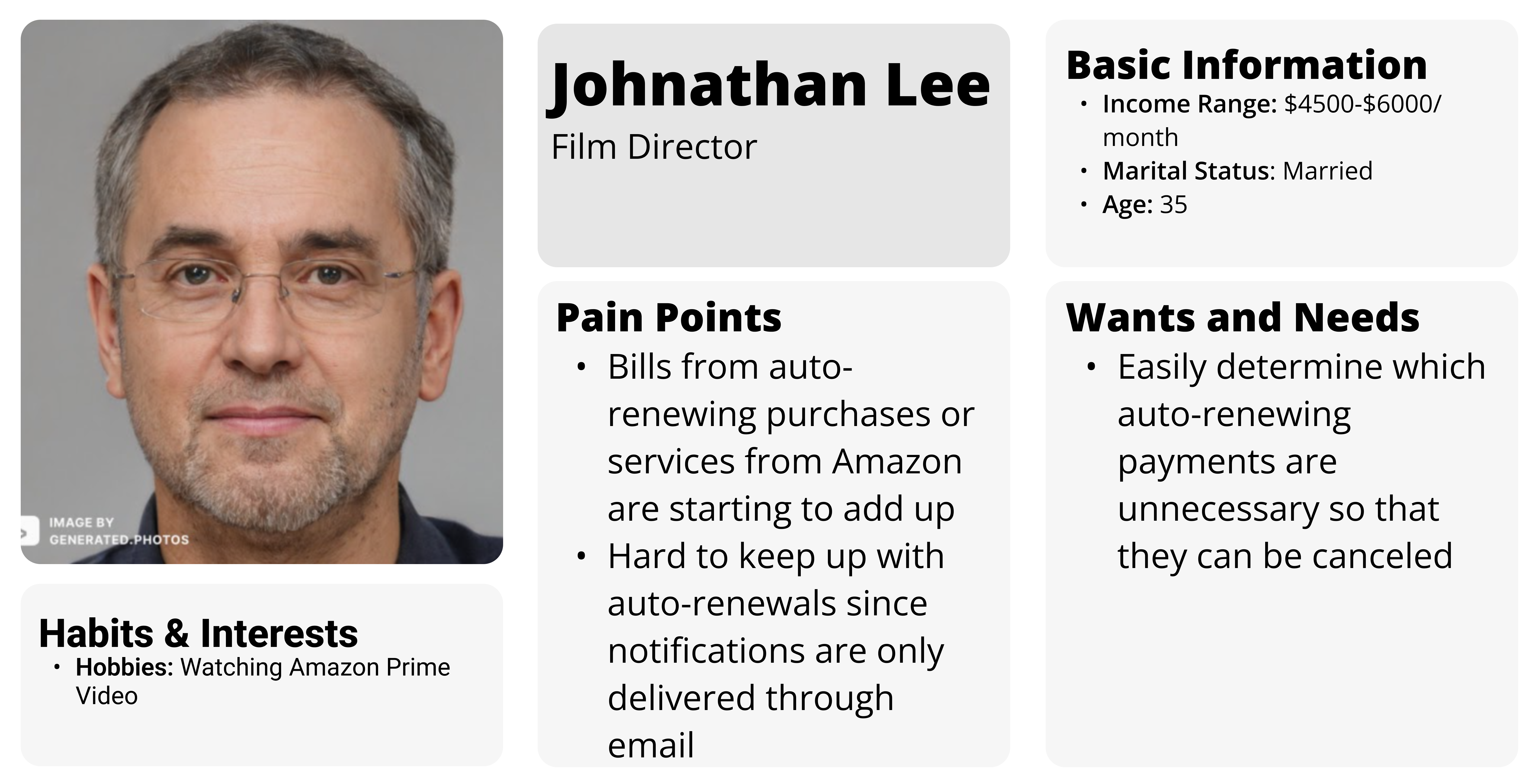
Secondary Stakeholder Persona
Finding the Correct Entry Point
A problem that we quickly encountered was where the user would be able to find our feature. We experimented with two different UX flows and subsequently created two low-fidelity prototypes. Each prototype had a different location for our feature and they each displayed information differently, but both prototypes would warn the user when they've reached their spending limit.
Entering From the Navbar
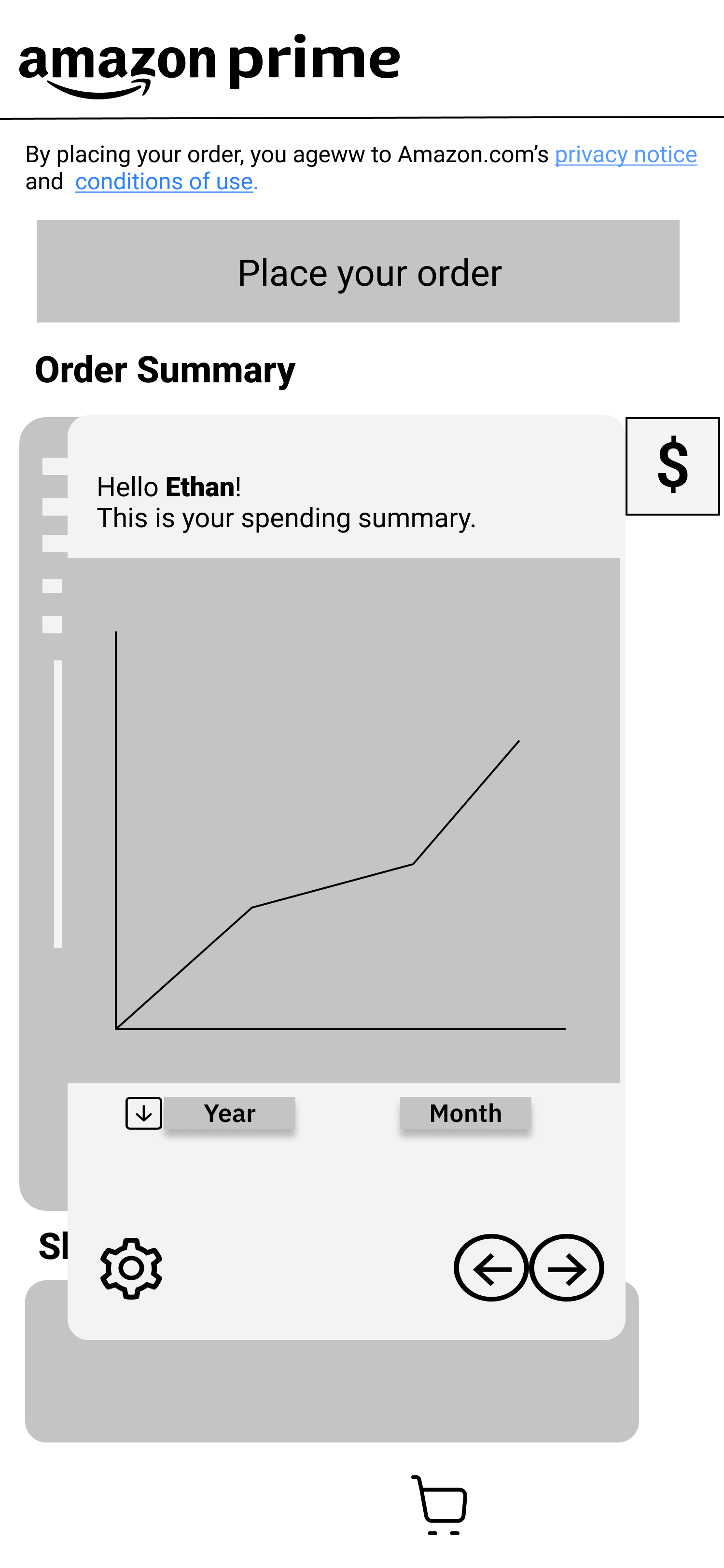
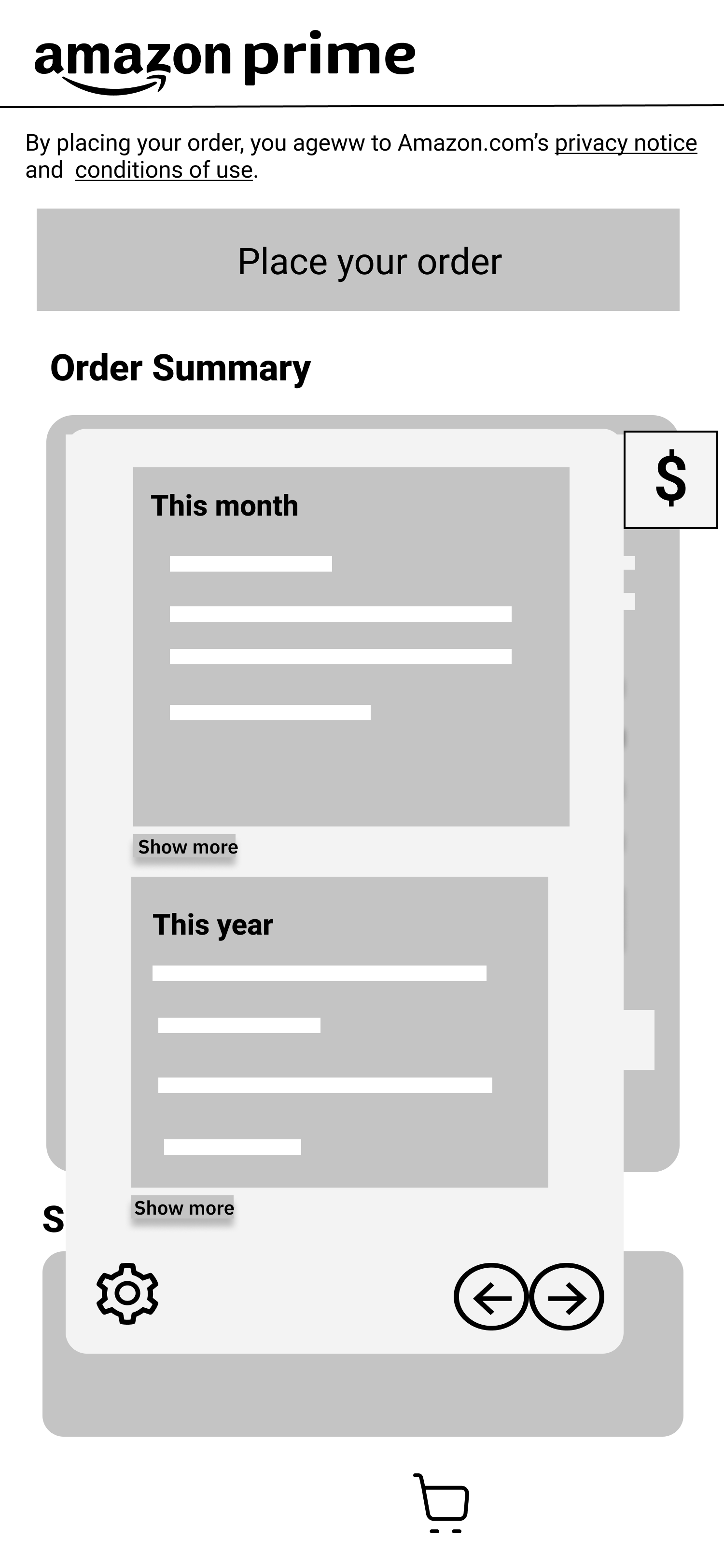
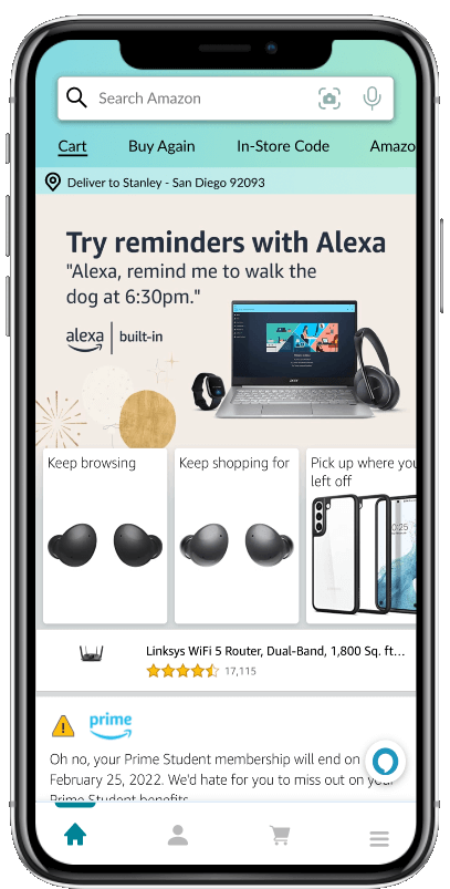
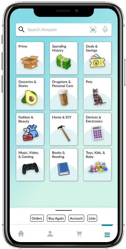
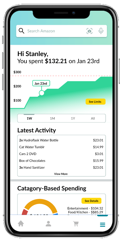
Our first prototype involves the user clicking on the hamburger menu on the navbar. From here, the user would click on "Spending History." This would open up a few screens that the user can navigate through the see their spending and set limits for each category.
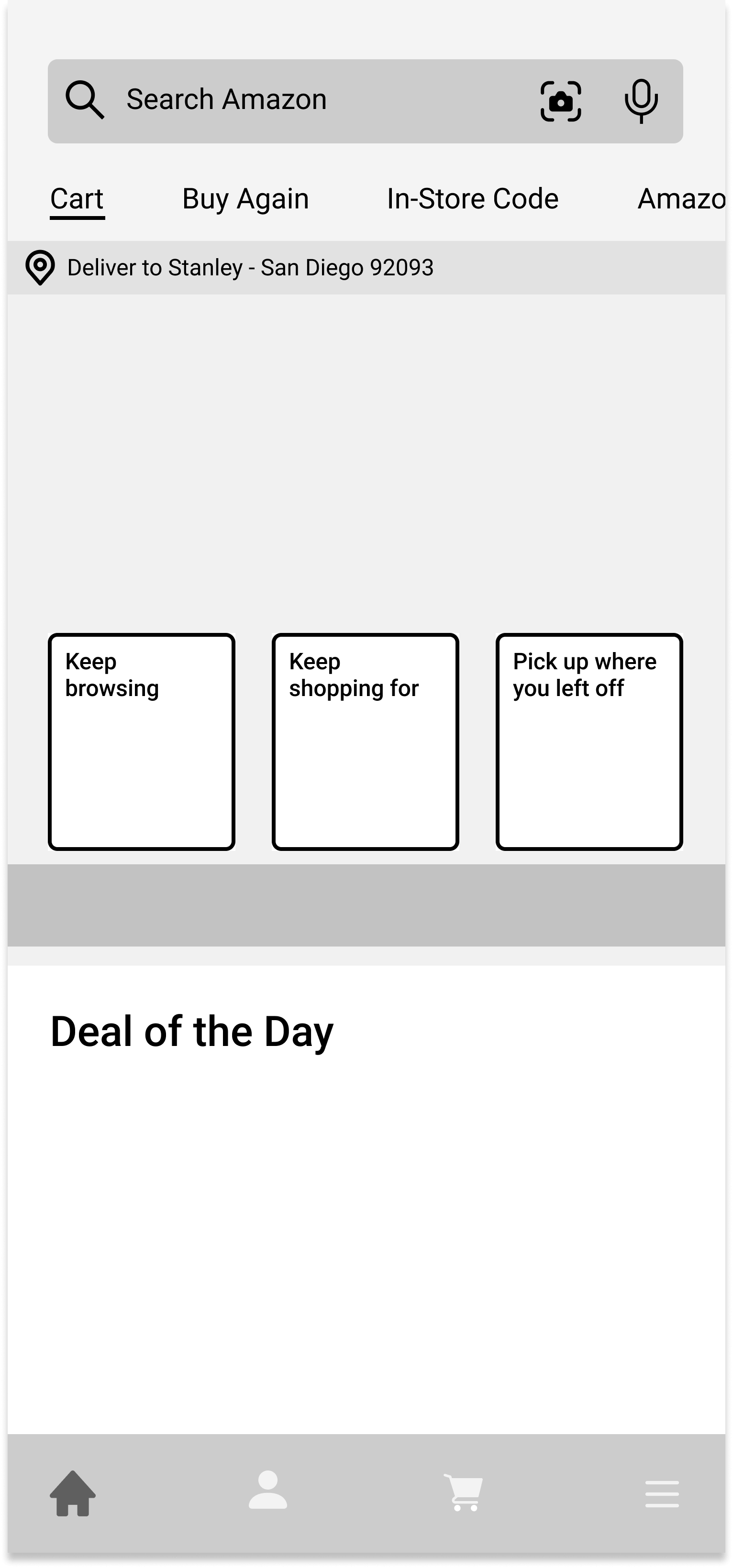
Home Screen
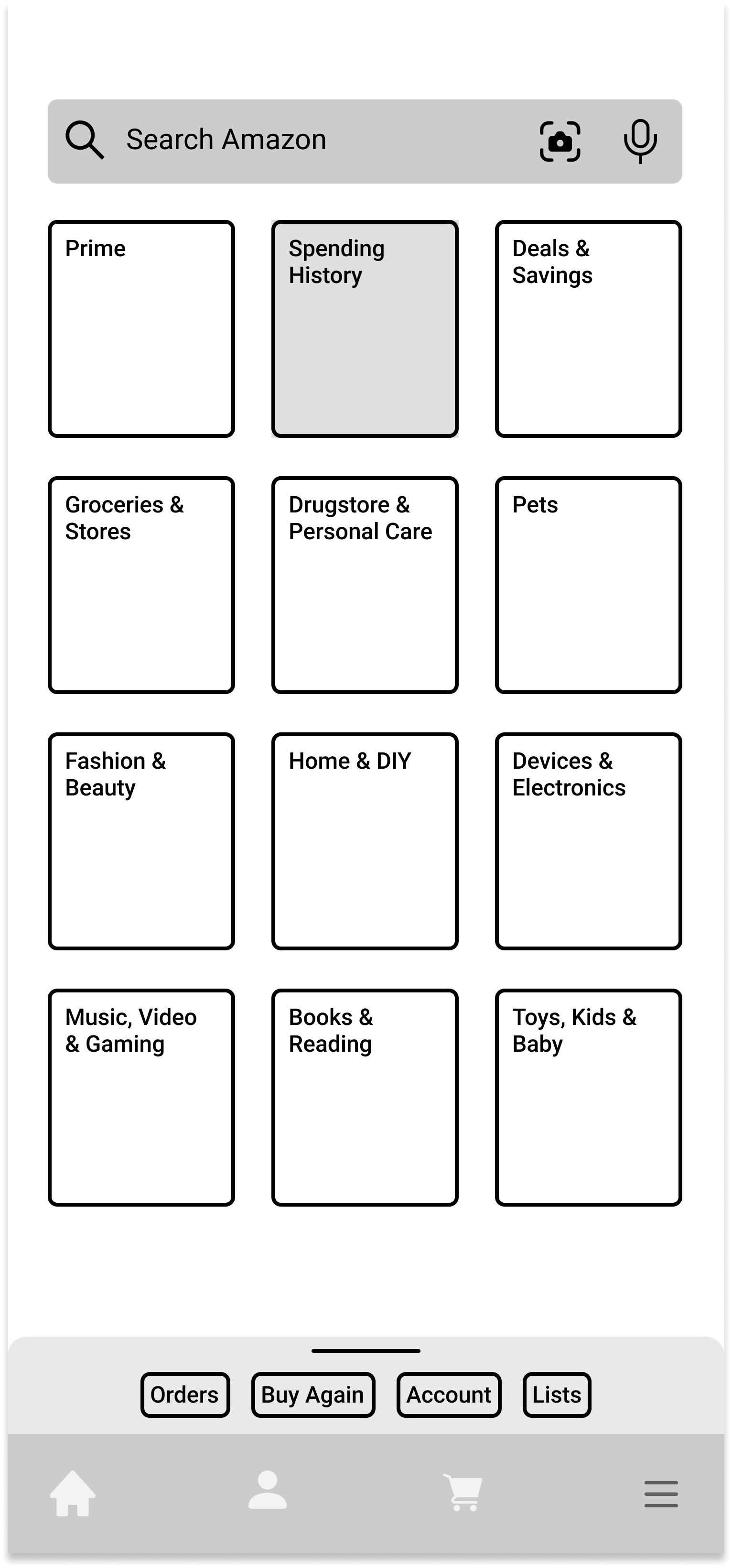
Menu Screen
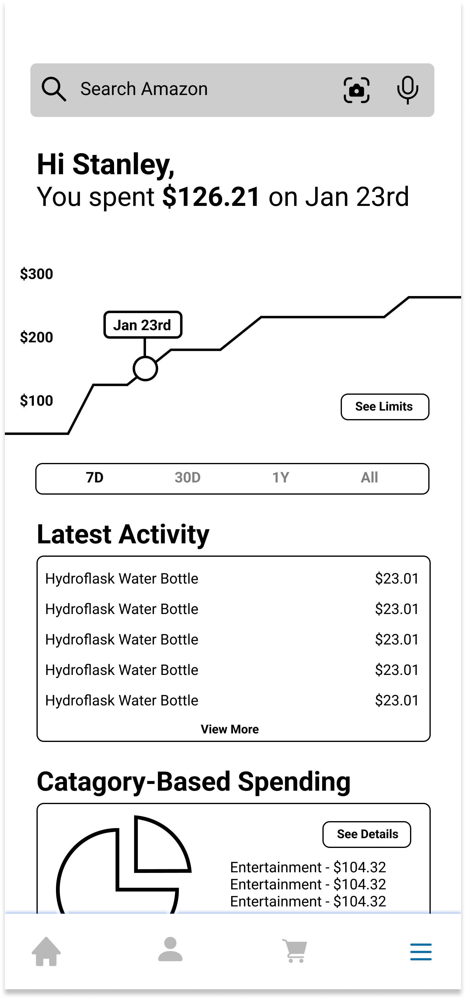
Spending Summary Screen
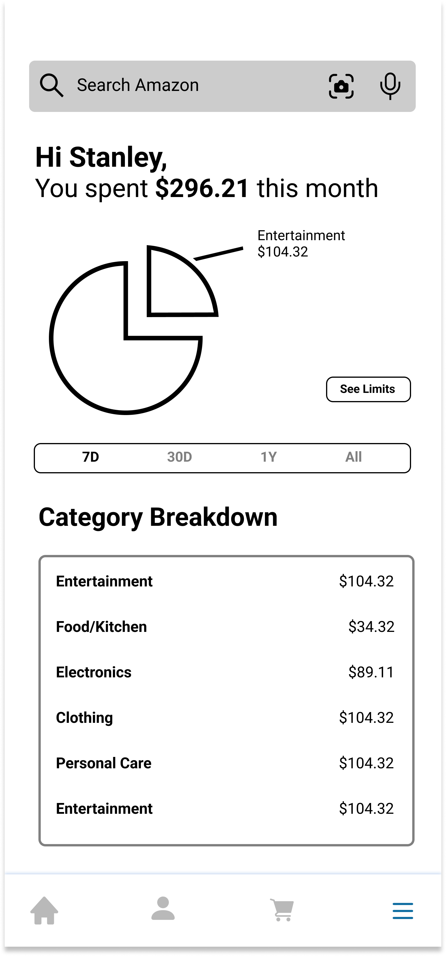
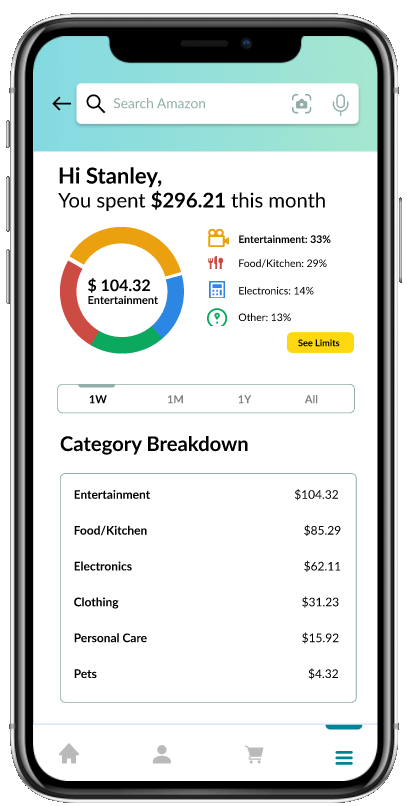
Category Spending Screen
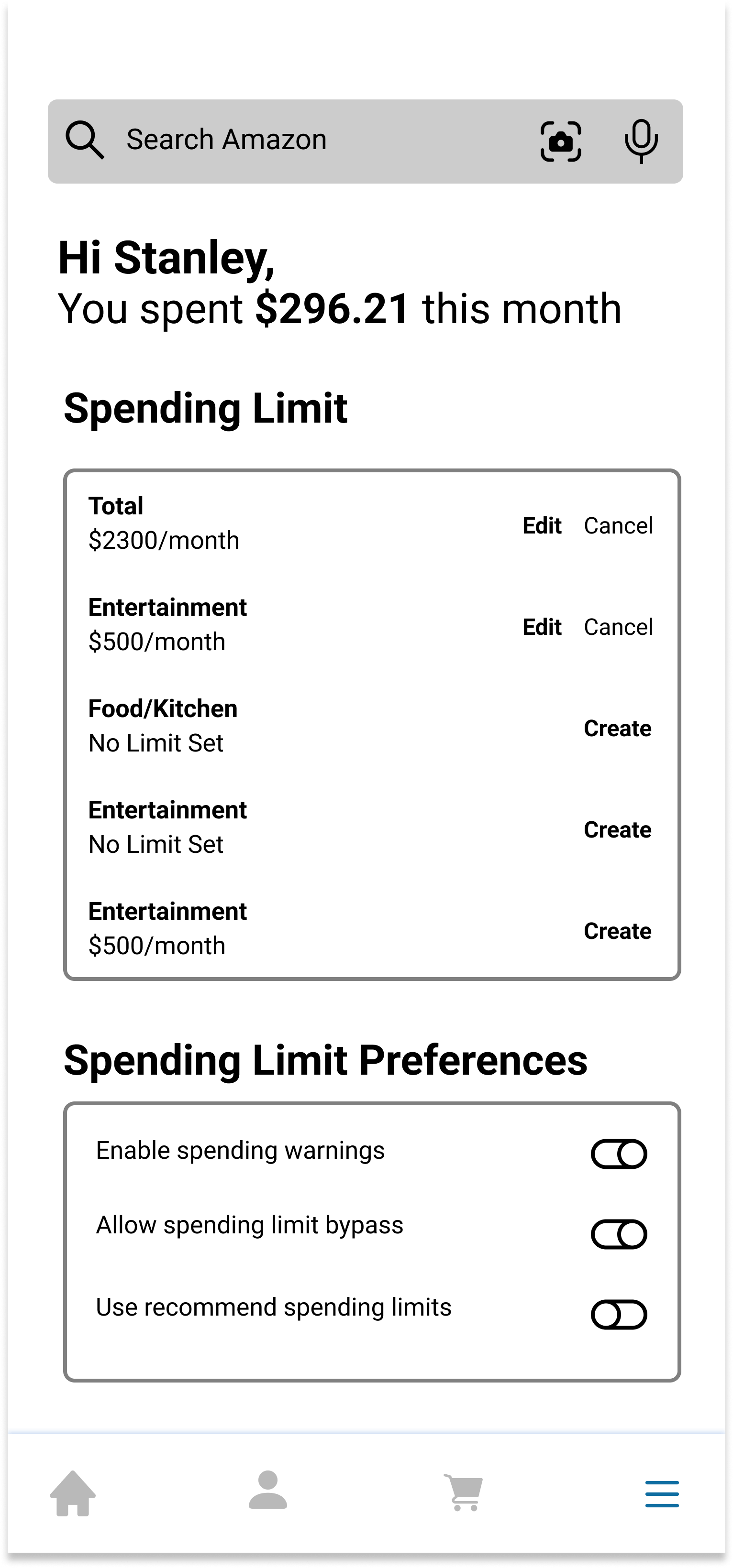
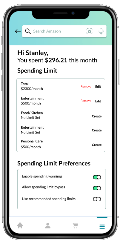
View Spending Limits Screen
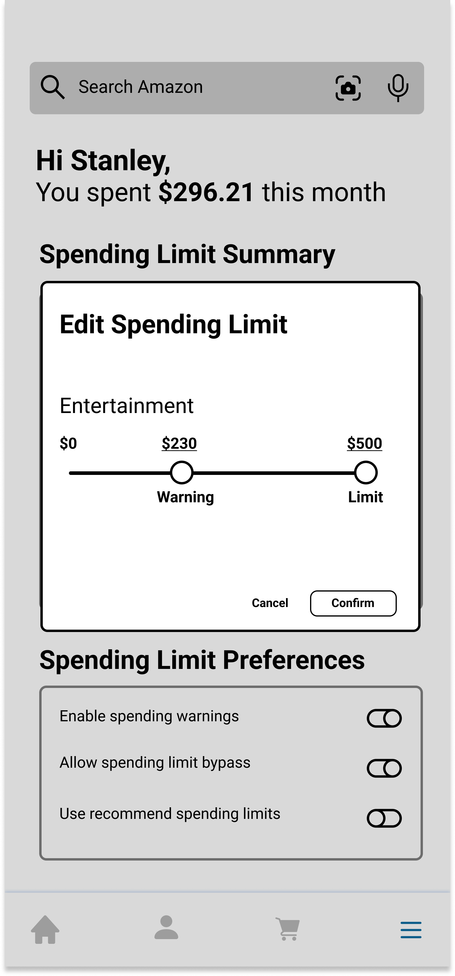
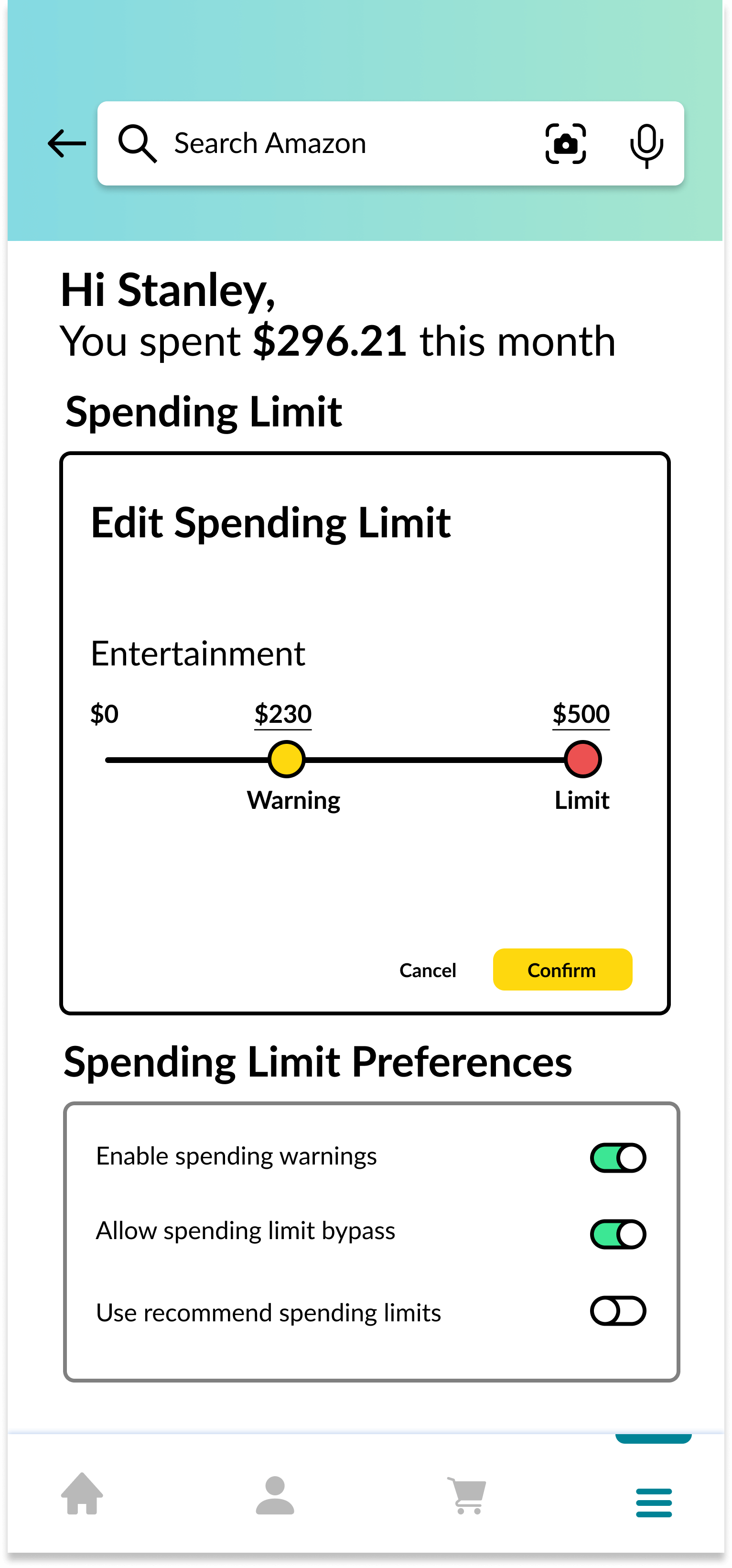
Edit Spending Limit Screen
Always Available Button
For our second prototype, there is a floating button on the right side of the screen whenever the user is viewing a product or whenever the user is in the checkout process, which means that it's always accessible. Clicking on this button opens the "Spending History" modal. The user can navigate through this modal using the arrows in the bottom right to see more information about their spending data.
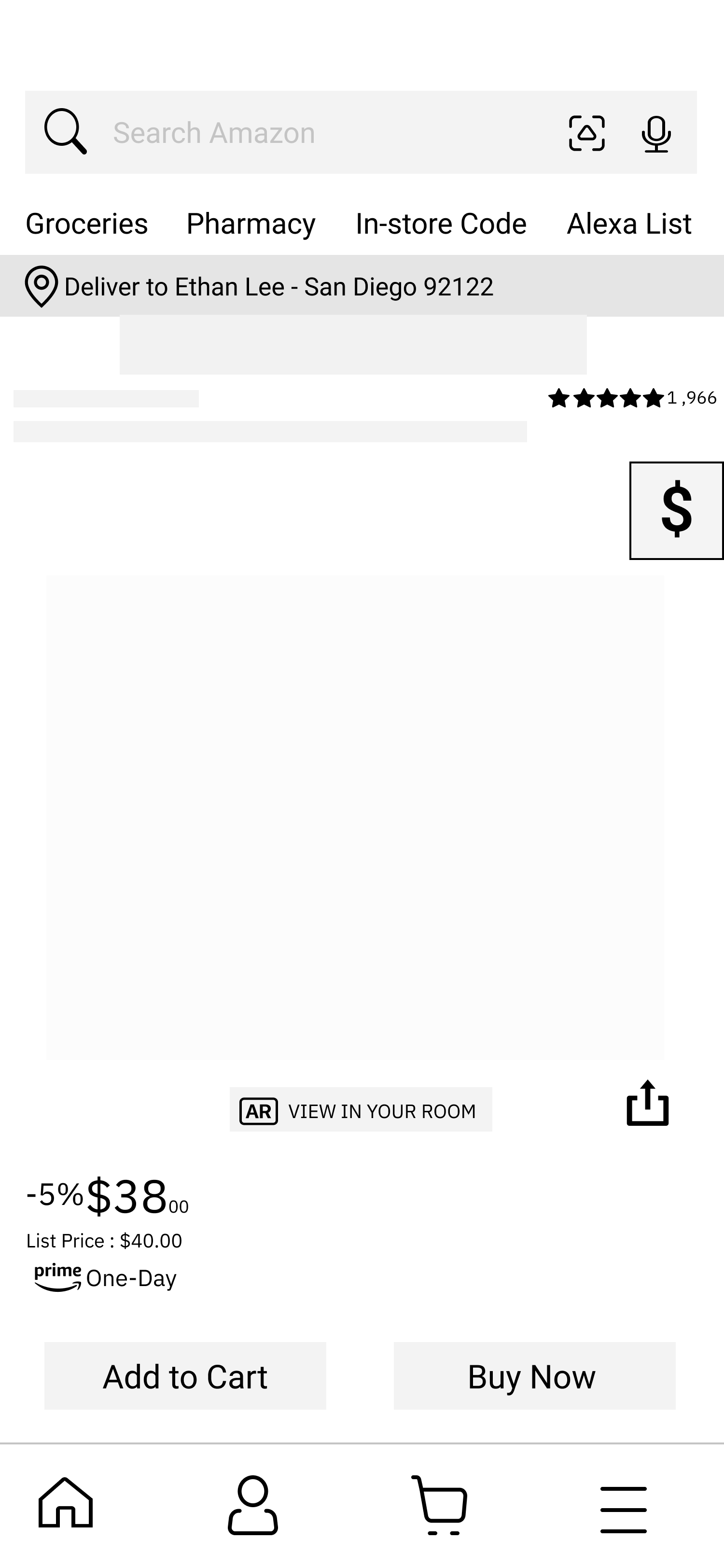
Product Screen
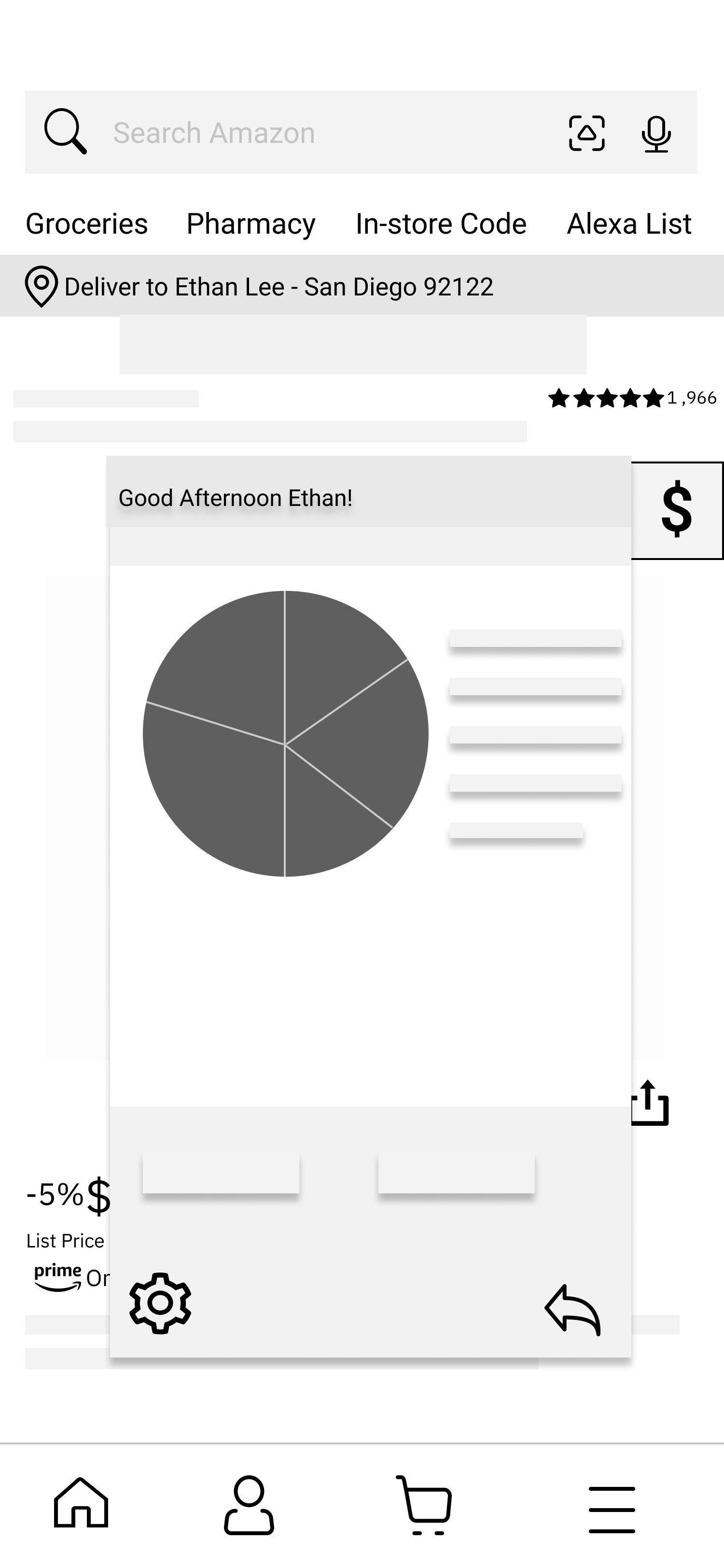
Product Screen w/ Modal
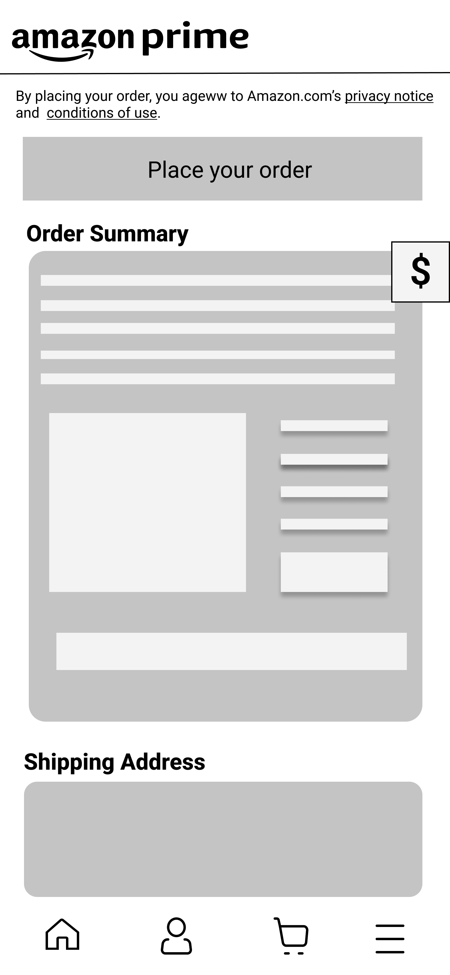
Order Screen
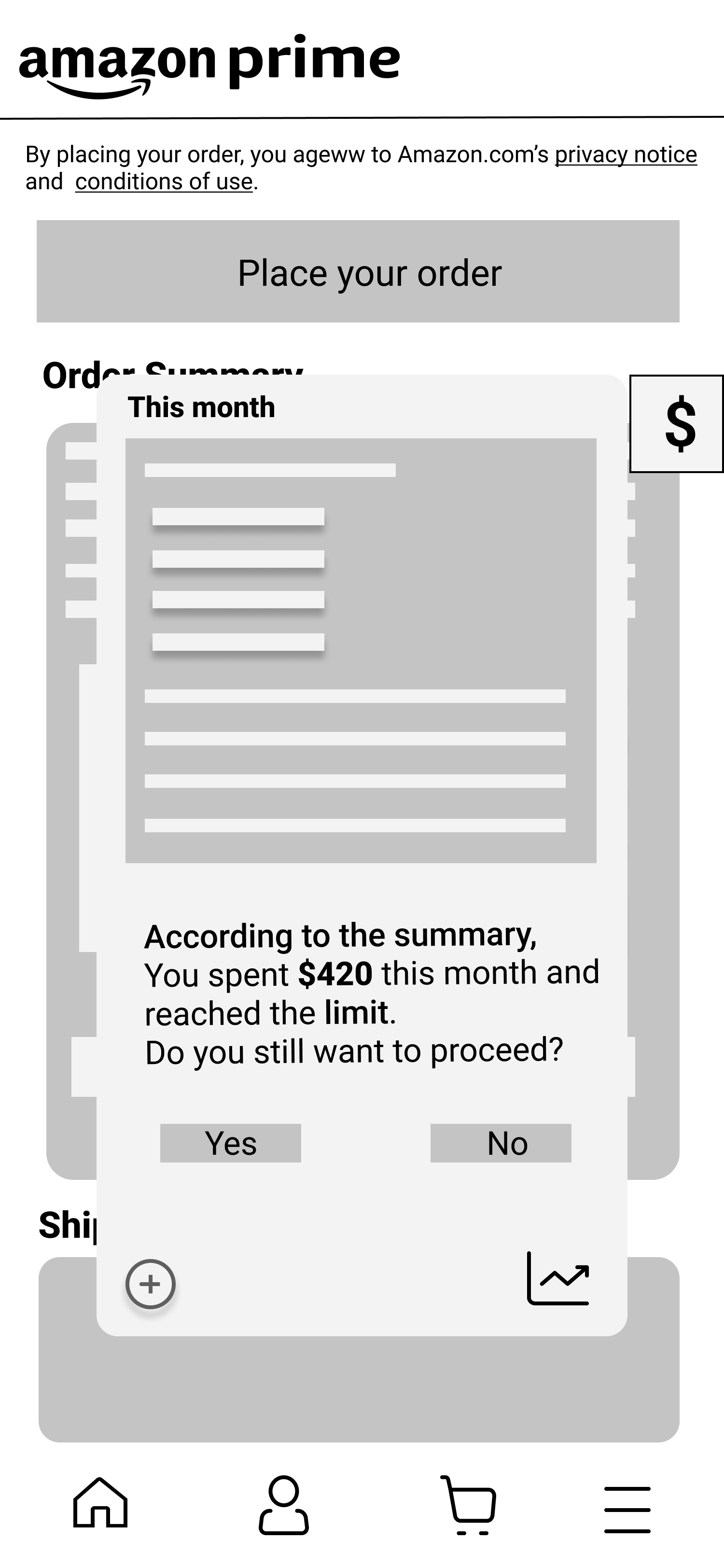
Spending Warning
Summary
Detailed Summary
Convenient or Intrusive?
We presented our two prototypes to four user testers and we emphasized questions about their experience finding our feature and their experience viewing data about their spending history.
First Prototype Feedback
- Most of our participants didn't have any issues navigating to our feature in our first prototype
- Once users got to the "Spending History" pages, they weren't quite sure how to go back
- Some of our participants were confused by the interface we chose for editing a spending limit
Second Prototype Feedback
- Our participants liked that the "Spending History" button was easy to find in our second prototype, but they didn't like that it took up space on every screen.
- Our participants were confused by our icons. For example, they didn't understand that clicking on the "Settings" icon would allow them to edit their spending limit.
Overall, our testers preferred our first prototype since they liked that there were dedicated pages for displaying their "Spending History" data. Since our second prototype used a modal, they thought navigating through a small modal was tedious. Although they found the floating button in our second prototype to be convenient, they also found it intrusive. We decided to move forward with our first prototype and build a high-fidelity prototype based on their feedback.
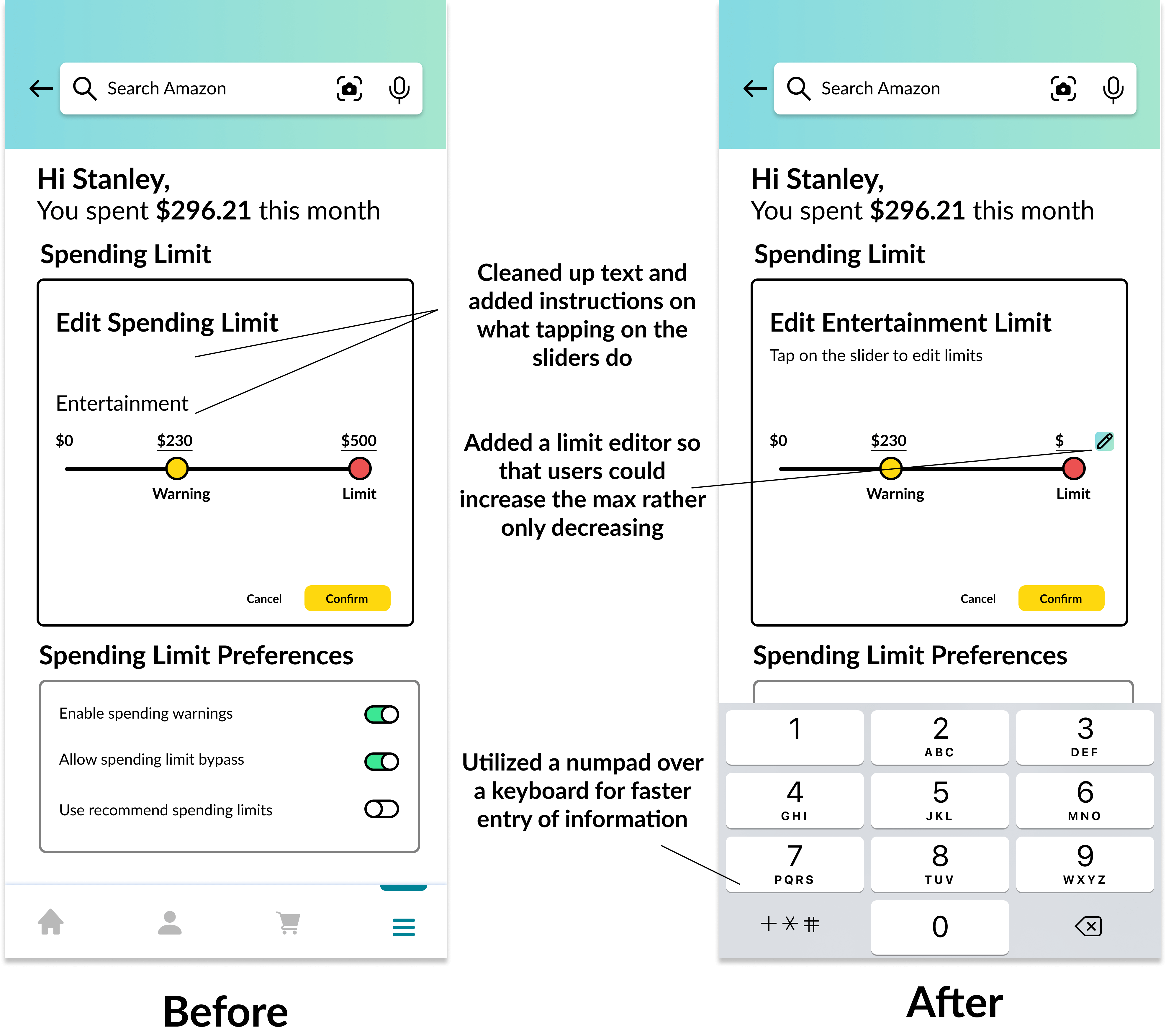
Iterating Based on Feedback
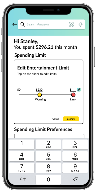
Since our testers found our slider confusing, we chose to make an alternative design for our "Spending Limit Edit" screen. Our alternative design is based on a scrolling interface that's commonly found in alarm clock apps. Then we conducted another round of user testing.
Original Editing Interface
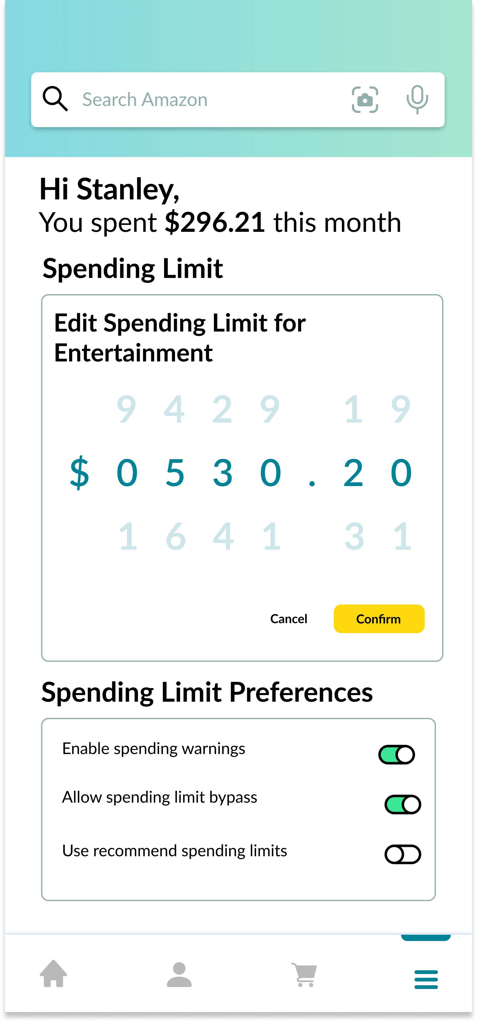
Alternate Editing Interface
Original Editing Interface Feedback
- Our interviewees understood that they could drag on the slider to adjust the Warning value, but they said they weren't sure how to adjust the Limit value. We had to explain that they had to tap on the Limit value and type a number to edit it.
- Once we explained this to them, some of them recognized this interface from other budgeting apps such as Mint.
Alternative Editing Interface Feedback
- Our interviewees understood this design, but they said it would be tedious to set a limit with many digits since they would have to manipulate each digit individually.
- Out of the two designs, most of our users preferred this alternative design.
We actually made the decision to move forward with our original editing interface even though our users preferred our alternative design. We learned from our users that the real issue with the original interface design was the visibility of its ability to perform certain actions, and not its usability. Our original design also provides more functionality by allowing users to set a Warning in addition to a hard limit, and, from our findings, it’s not as tedious to set a large limit as our alternative design.
Final Design
Home Screen
Menu Screen
Spending Summary Screen
View Limits Screen
Edit Spending Limit Screen
Category Spending Screen
Product Screen
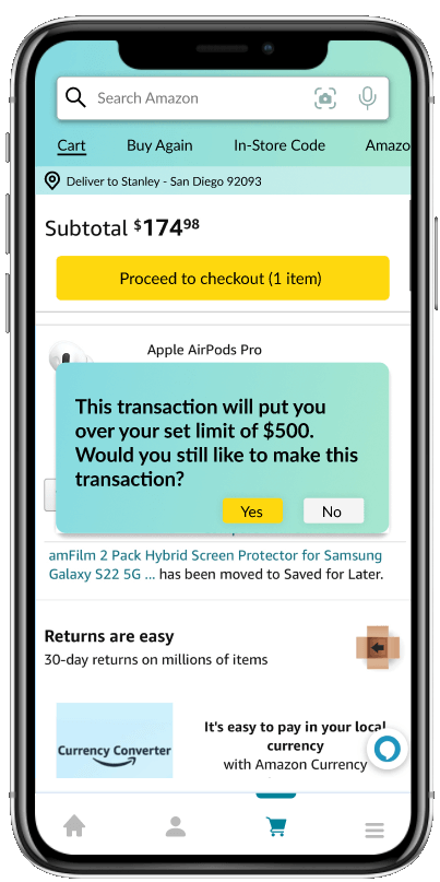
Spending Warning
Reflection
We created this project for the class COGS 127: Data-Driven UX/Product Design and it was interesting to replicate an existing platform in Figma. In most other projects I've done, I've designed new platforms instead, so I felt that I learned a lot from following the design guidelines of the Amazon app.
From deciding on how the user should navigate to our feature from within the Amazon app to refining our Spending Limit Editing interface, I believe that this project greatly helped me improve my skills of interpretting user testing data. Rather than just blindly choosing a design based on what a tester prefers, I feel that I can make the most of user testing data to iterate on my designs.
Finally, we made heavy use of Figma's components during this project. This allowed create certain elements, like the search bar, once and then reuse them across multiple screens, but, most importantly, components allowed us to essentially transition our low-fidelity prototype into our final high-fidelity prototype. Since we built our LoFi with components, we were able to just update those components when we started working on our HiFi. I hope to learn more Figma tricks like this as I continue my career as a designer.